ILS1 ART semester 2 Phase 1 – Summary
Graduate plus:
Table:
Certificate:
Essay :Contrasting two modern artists who work with pearls – relatively traditional and relatively avant-garde
Normal version:
Pure version:
Cover sheet and reference list:
Week Reflection:
Poster research:
Typography
A rangement tax. Make writing together.

A way to use text as a visual to convey a message.
Notes:
Typography n.
People use every day life.
It is a style.
- Common types of form:
Serif is the classic main letter. Often use in magazines and nespapers
Sans of serif. Often appear in computer or phone.
A display like fancy or decorative art.
The word has different form and show different message like comis like classic.
Less is more. Just choose one or two.
If need contract can use more black or big.
opposites attract
Use word be more profisional
more confident isimportantn, do not nee tod know all about it.
Just use few style in poster
Leading.
Must read clealy
Tracking is character spacing, it hlep people fix front.
Kerning, unlike tracking it is defferently.
Interesting typography need see and do more.
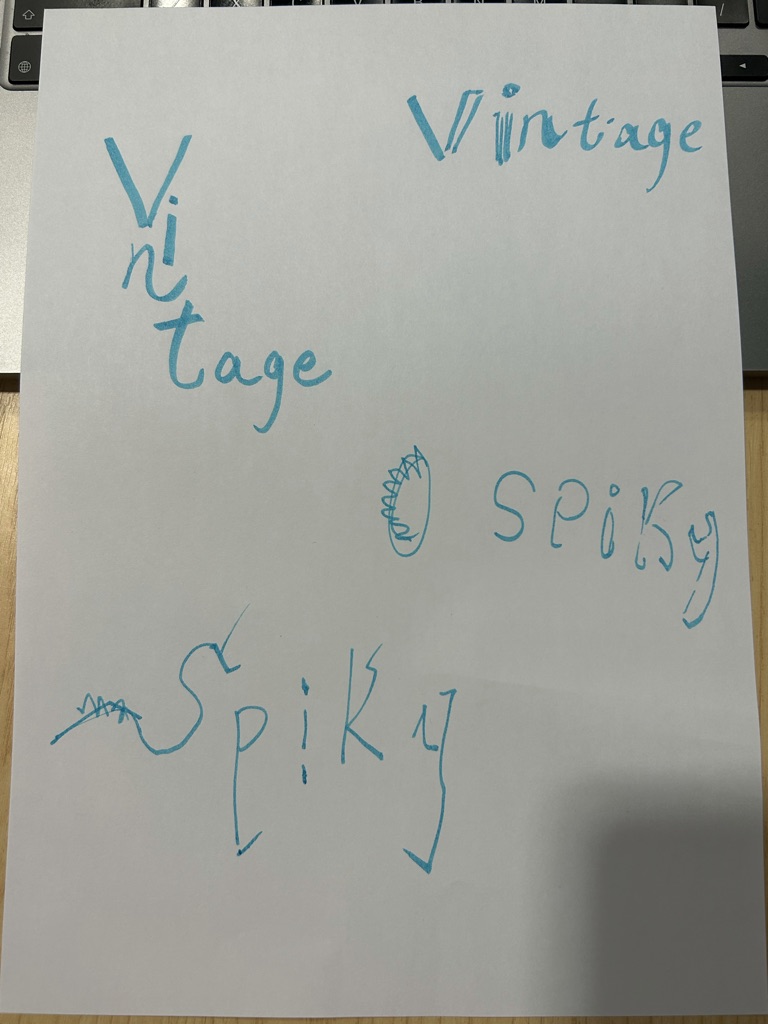
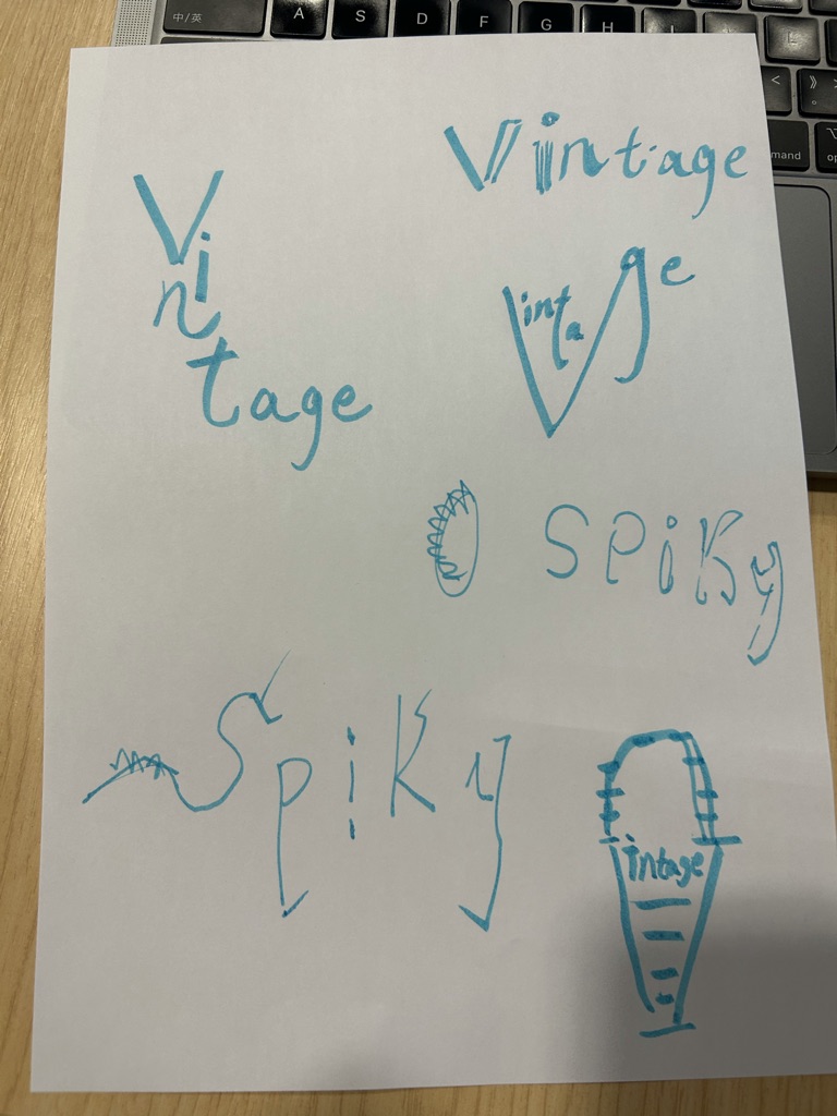
The design of self front:


Task:
Based on the previous video, I learned that there are three most important things to keep in mind when choosing a font to create a poster. Firstly, the font style should be consistent with the style of the content being presented. Secondly, there should not be too many fonts used in a poster. Thirdly, the font should be clear because fonts are there to present ideas clearly.
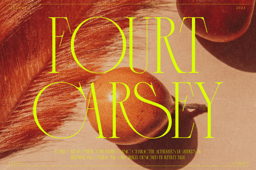
I started by looking for a font that would be suitable for the title of the poster, which I thought would be large enough that a classic or slightly more fancy font would not prevent people from reading it clearly. So I looked at a large number of different styles of fonts. Also, depending on what I was creating, there was an important element in my work, which was the snake. So I was looking for a typeface that had the softness of a snake. So I finally found the one that fitted best. The “Fourt Carsey Font” has a snake-like curve to the “C” and “S” letters. In addition, the words used in this font usually have a feature that some of the letters are compact but the larger letters have a large white space. This white space makes the more ornate text clearer and more recognisable. At the same time it reminds me of a snake feeder. When one sets up a rearing box, one needs to divide it into two areas, one is a relatively empty area for the snakes to bask in the sun. The other is an area with some piles of hiding places. I think it is very similar to the layout structure of the font. That’s why I chose it. Because the typeface is closely related to my theme and is also aesthetically pleasing and special in its own right.
Next I started looking for fonts for the text section, which I think is not as much of a choice as the poster section. As the text section is smaller than the headline, some artistic and fancy fonts were already ruled out to ensure the most basic principle of clarity of meaning. I therefore turned my attention to sans serif fonts, which for the most part have uniform, clean lines and are easily recognisable. At first I chose the industrial German typeface DIN, because the world’s largest reptile zoo is in Germany. But when I looked deeper, I found that the DIN font was rather thick. The Fourt Carsey Font for the title, however, is a slim-line font. If you put them directly together they would be top heavy. Finally, I looked for Futura Front, which I think is the most suitable font at the moment. Visually, it has a clear outline and a slimmer font that works well with the Fourt Carsey Font. In addition, and more importantly, although there is no clear association, this typeface is still seen as modernist with Bauhaus influences. The use of some metal in the materials of my final work is also influenced by this style. I therefore consider this typeface to be more in keeping with my style of expression.