
New semester
About
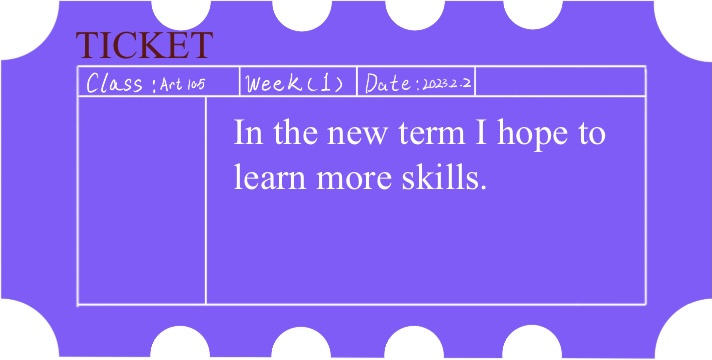
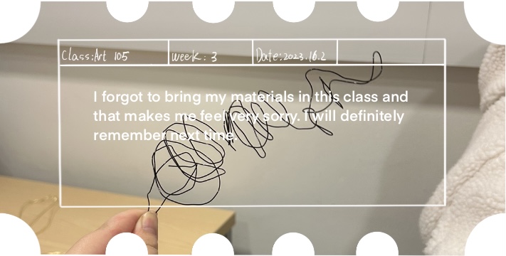
In the new term, the teacher again introduces the rules of the class. And briefly described the objectives of the term. I think it is a good thing to emphasise goals in the new term; a clear sense of purpose can help people to work reasonably hard.
Summary:
Today, we had a sketching session. I started by drawing a few plants at different times and in pencil according to the angles I saw.

I also painted some fruit, which I seem to be less good at than plants. But I still tried a few more times.

I think I have drawn quite a few plants and I should know more about his shapes. So I tried to paint the picture with just one stroke. This is my understanding on the form of this plant.
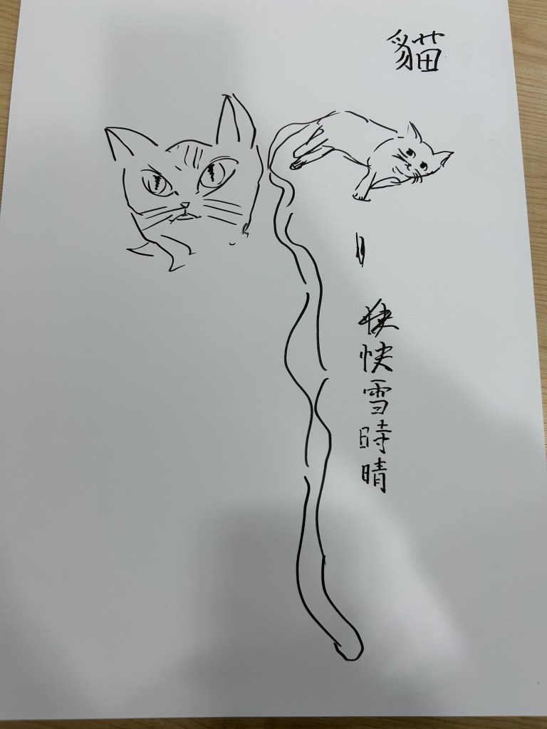
After sketching I try to draw cats.
–
Summary:

2023.13.2 – 2023.17.2


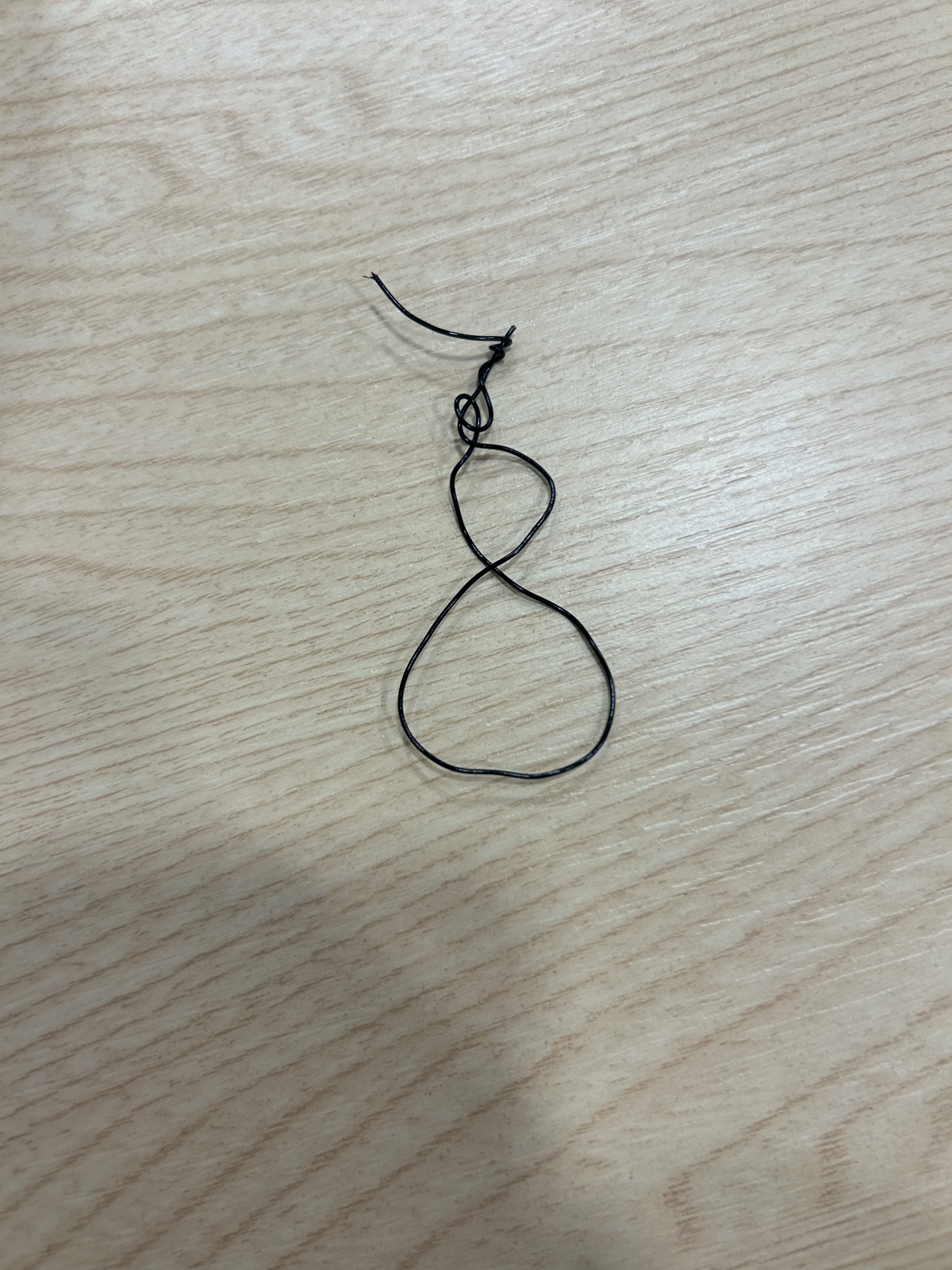

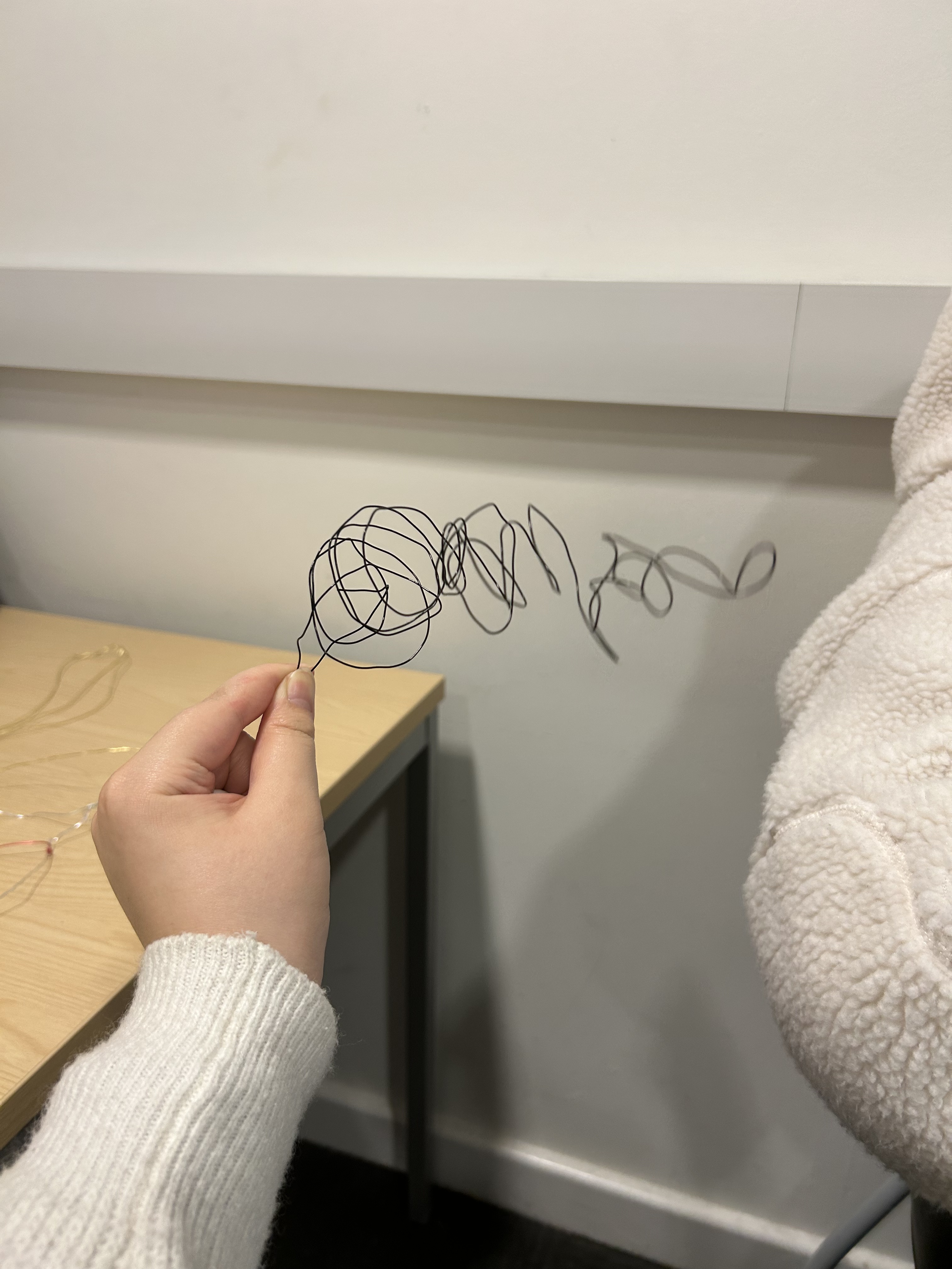

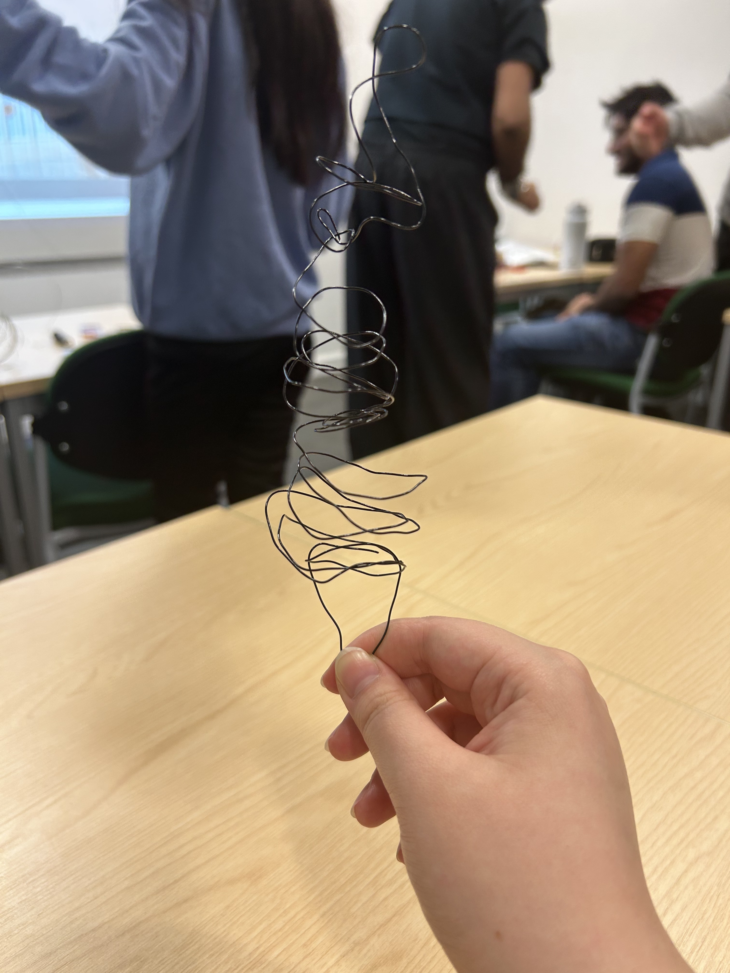

In this class I learnt how to make different pieces of wire from different kinds of wire.
- I made a fishing woman who could stand up for herself. Her hook can hang down. Also I made the detail of the line falling from her fishing rod.
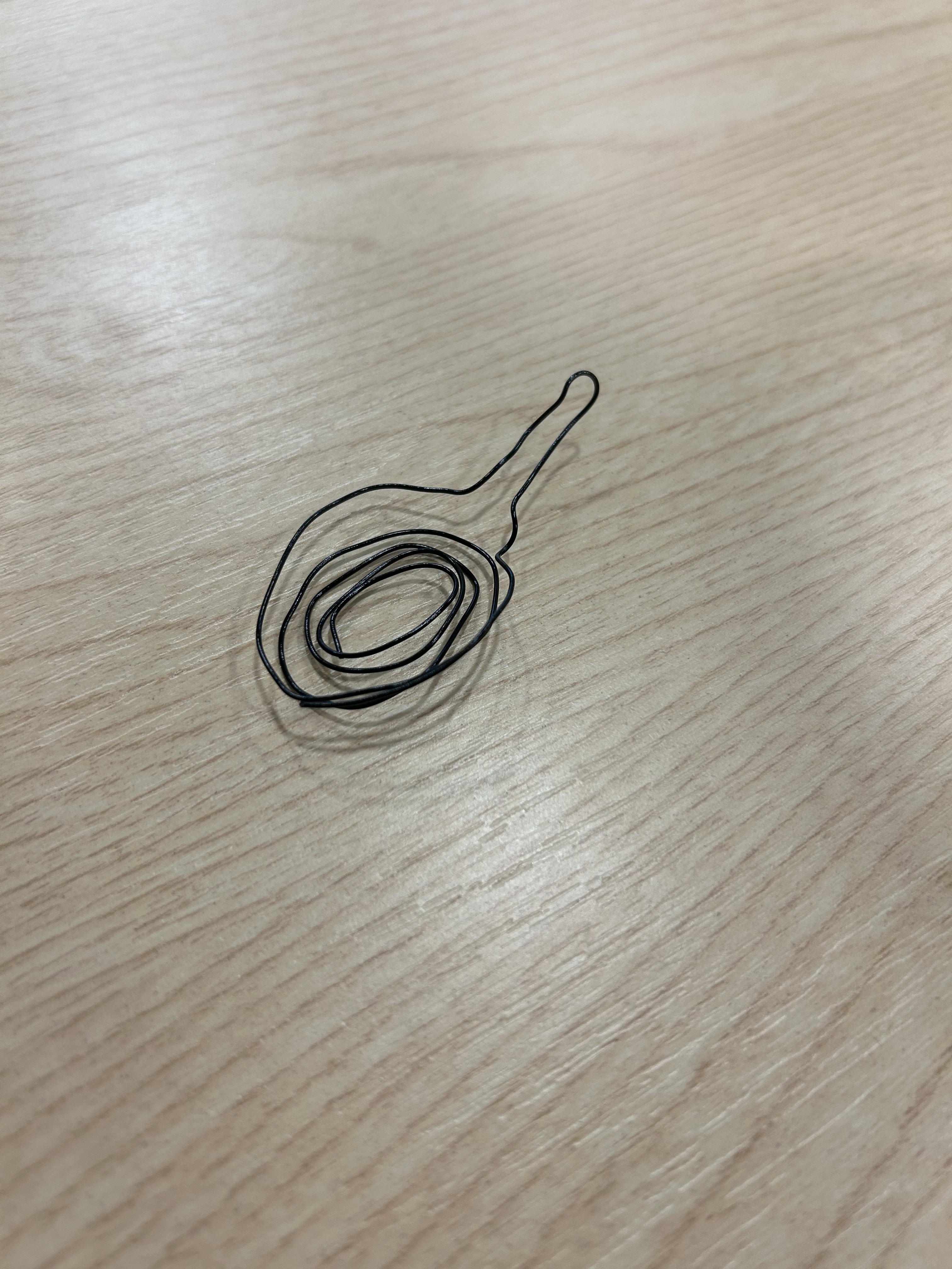
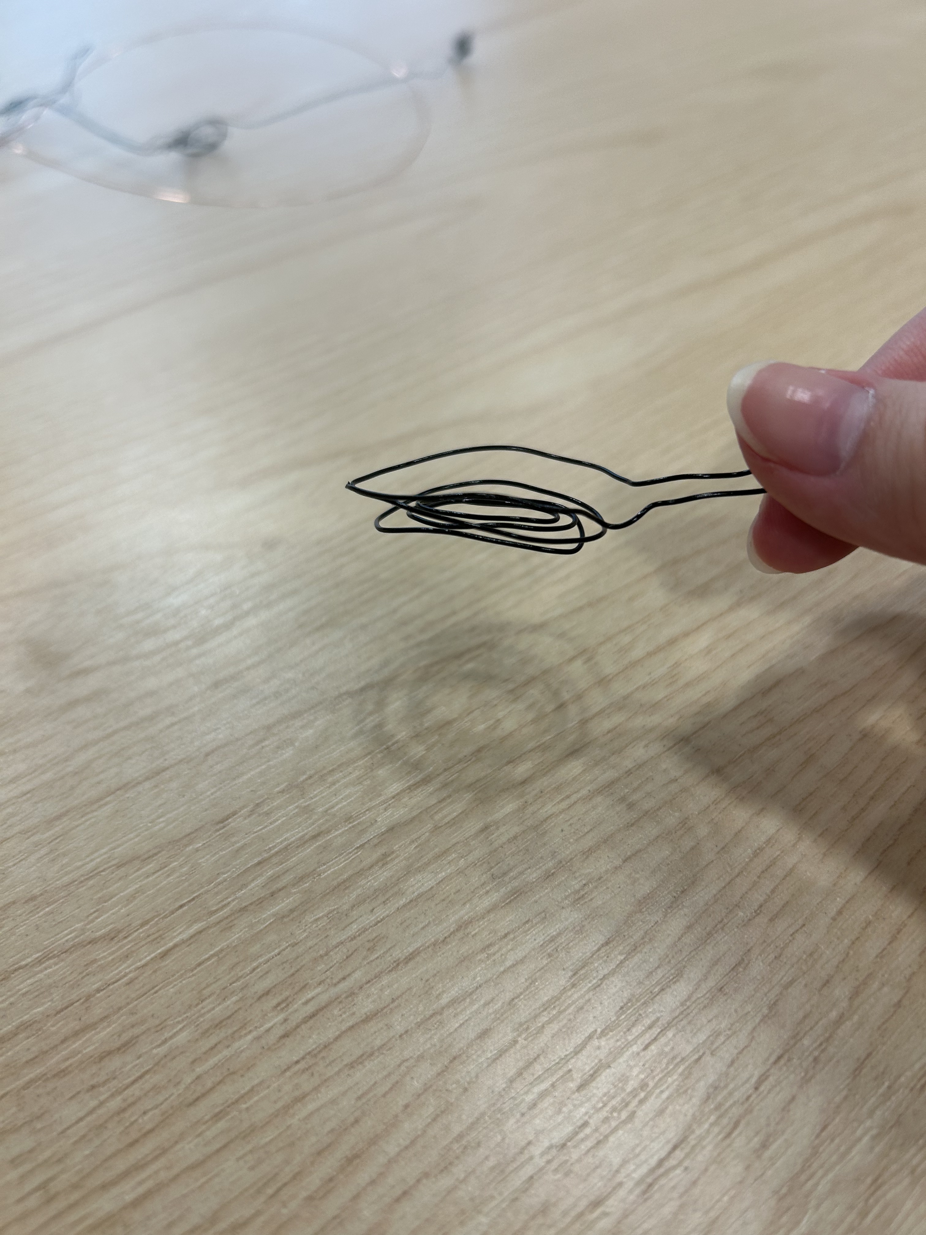
- I made a small frying pan, the black hard material fits the look and feel that the frying pan gives. It has a metallic feel to it and fits in very well.
- I made a goldfish which connects the story. It is caught by the woman who fishes and then placed in the frying pan.
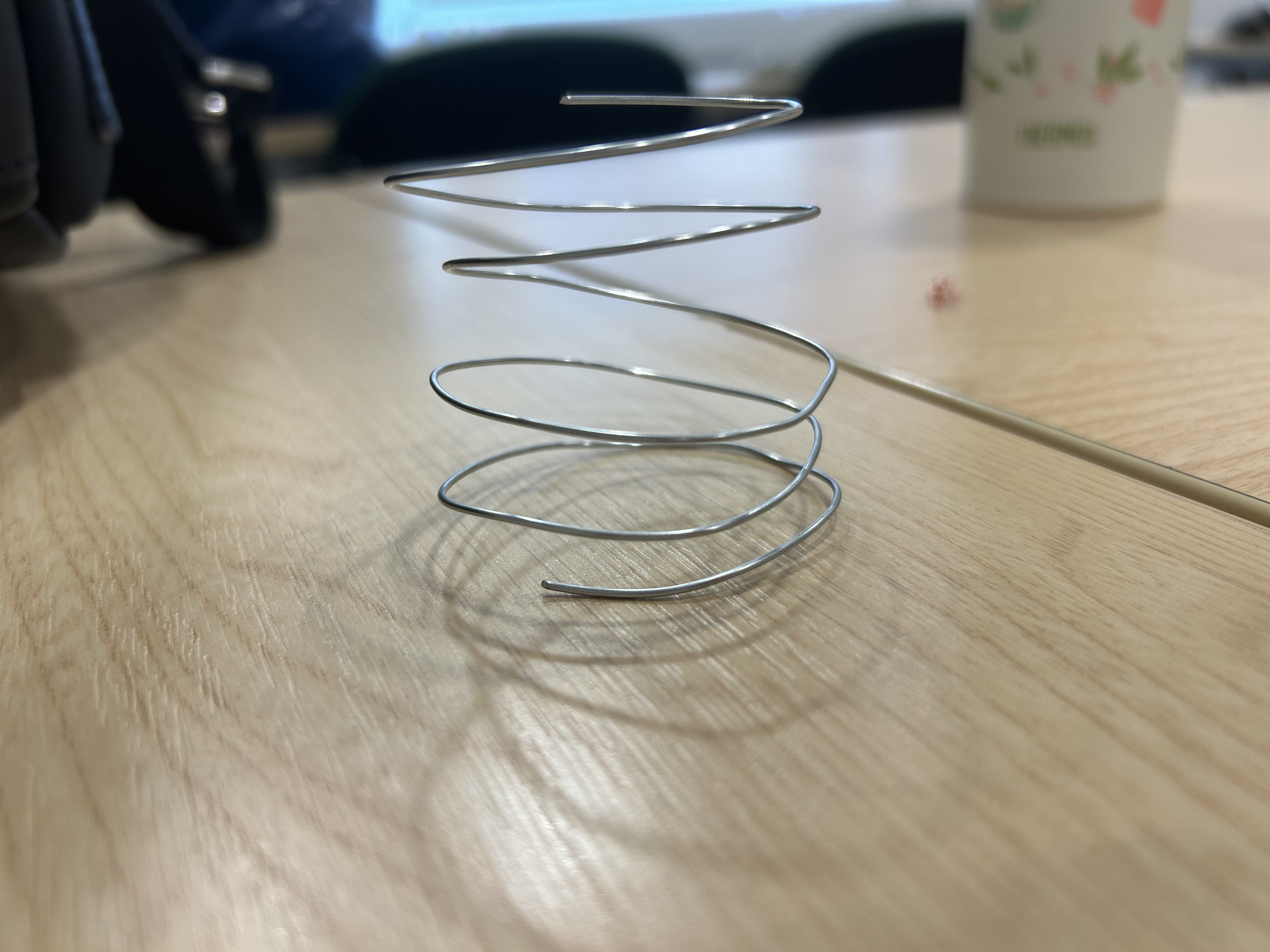
- I used a harder silver wire and I made a spring out of it. It hardly deforms, but it is a bit stiff making shapes by hand is not easy.
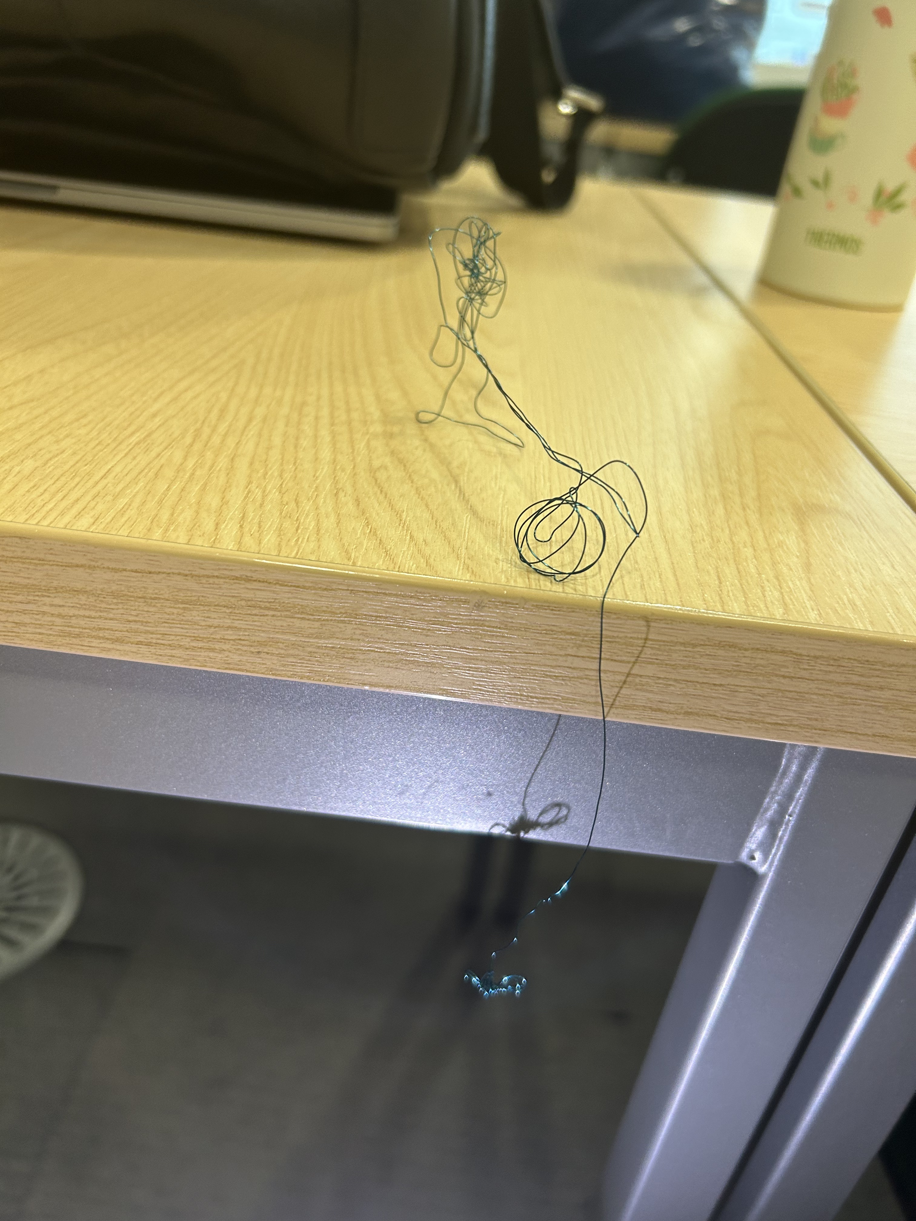
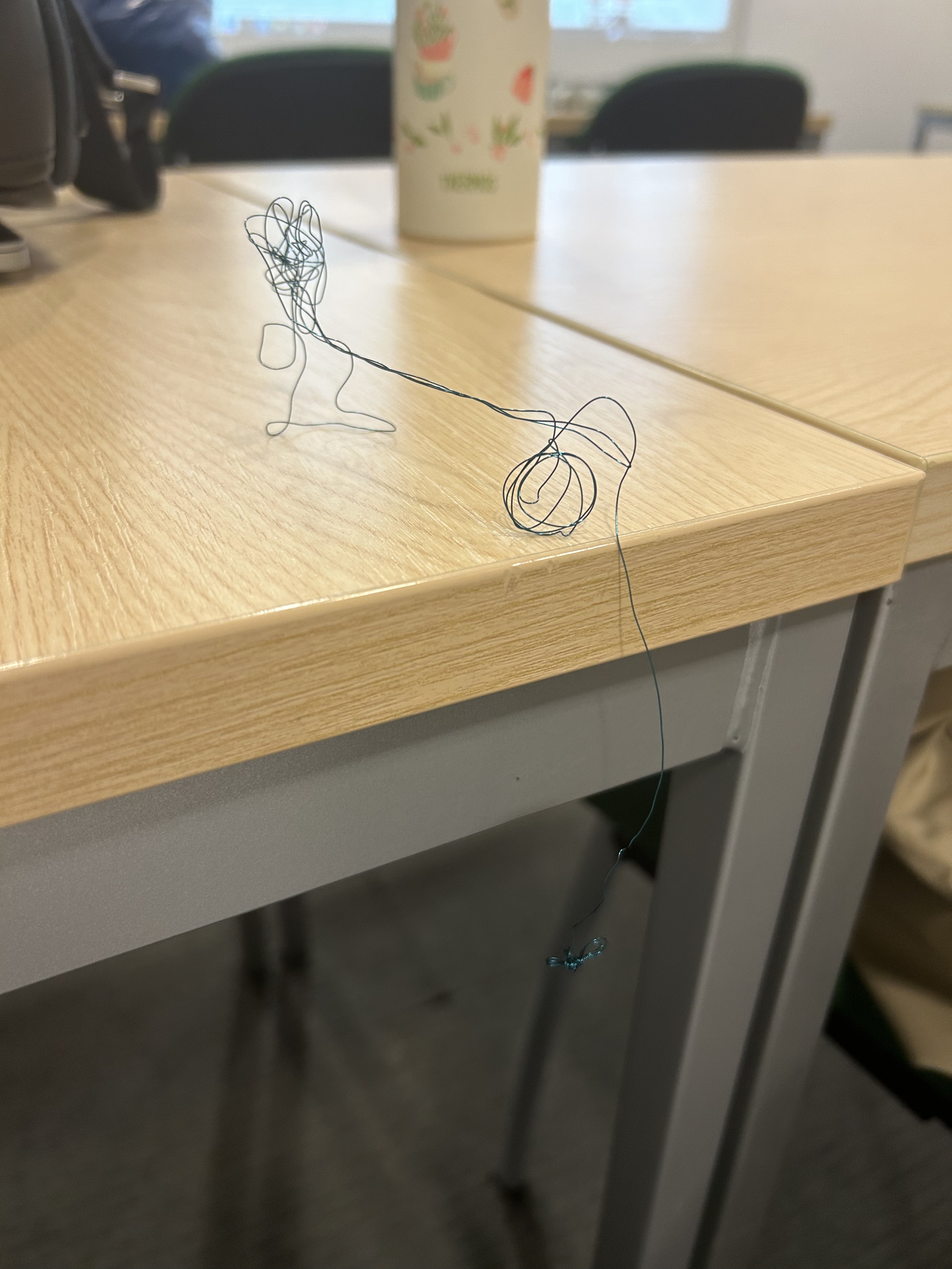
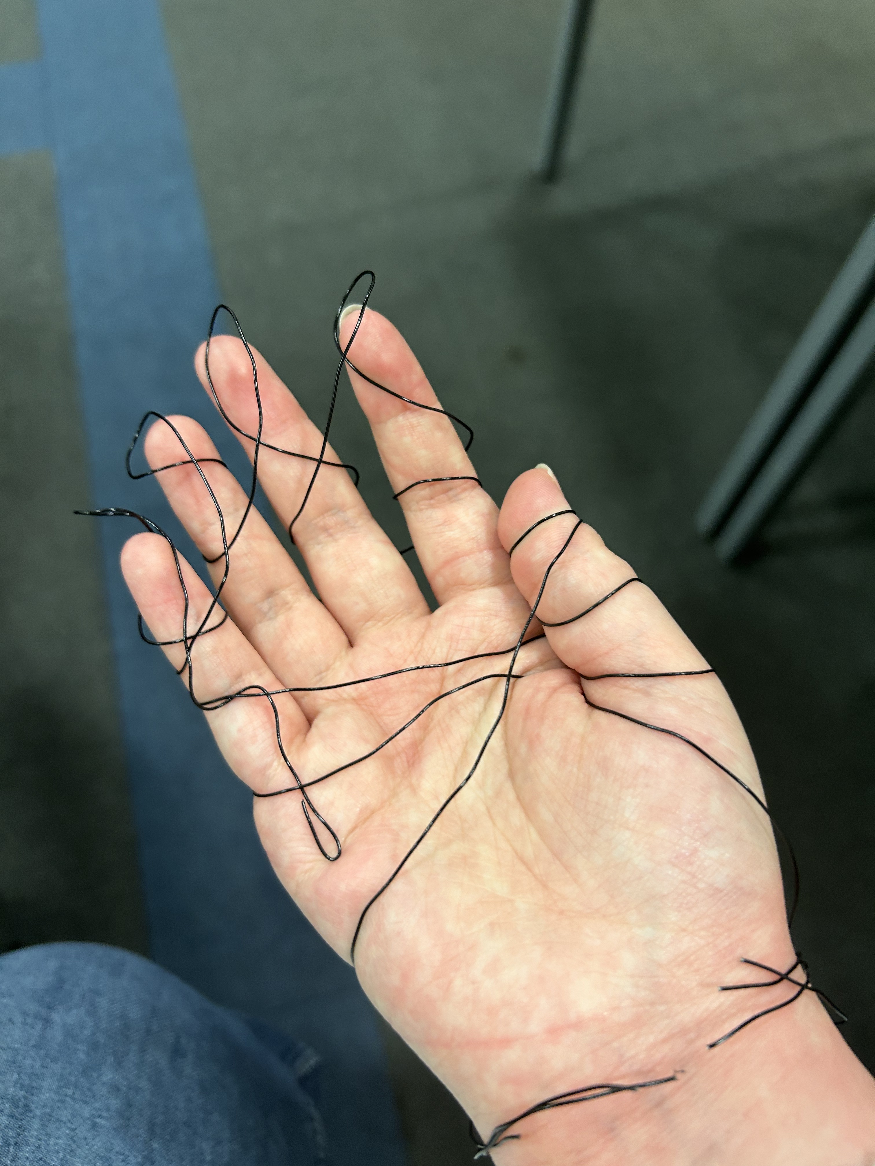
- After I wrapped the wire around my hand and struggled to free it, I wanted to record the strength of my struggle with the wire.
- I made a ring that was attached. (Three) Kind of like a finger tiger.
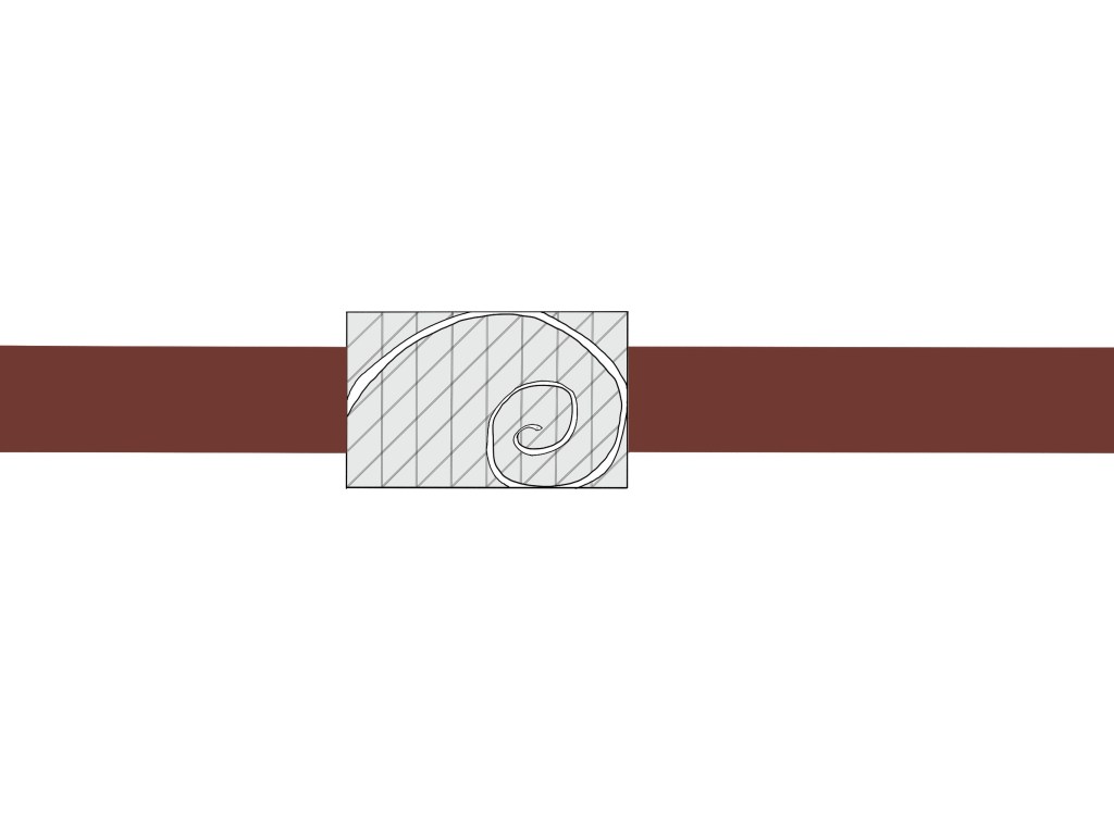
- I made a gourd.
- I made a dialog box to put it on anything.
- I made a giant ice cream that will collapse in the next second, inspired by the spring I made earlier. It wobbled and seemed to fall to the ground at any moment.
- I made a giant ice cream that will collapse in the next second, inspired by the spring I made earlier. It wobbled and seemed to fall to the ground at any moment.
Summary:
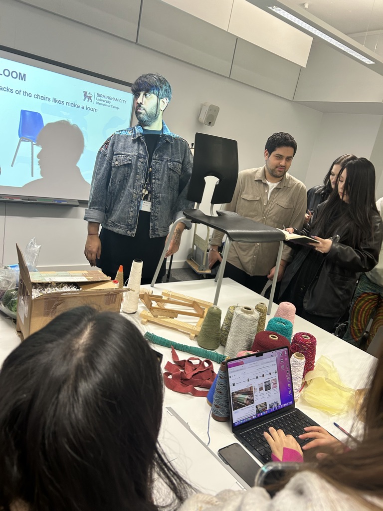
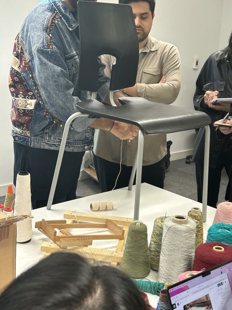
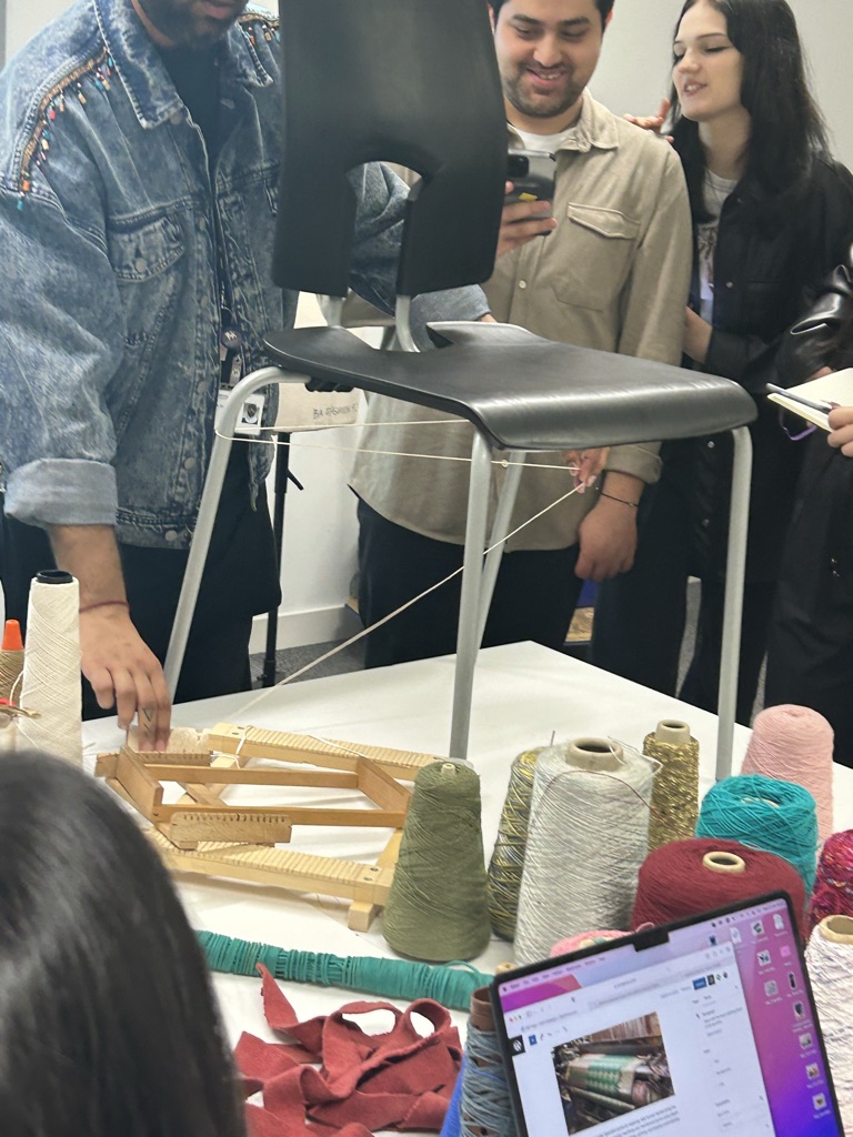
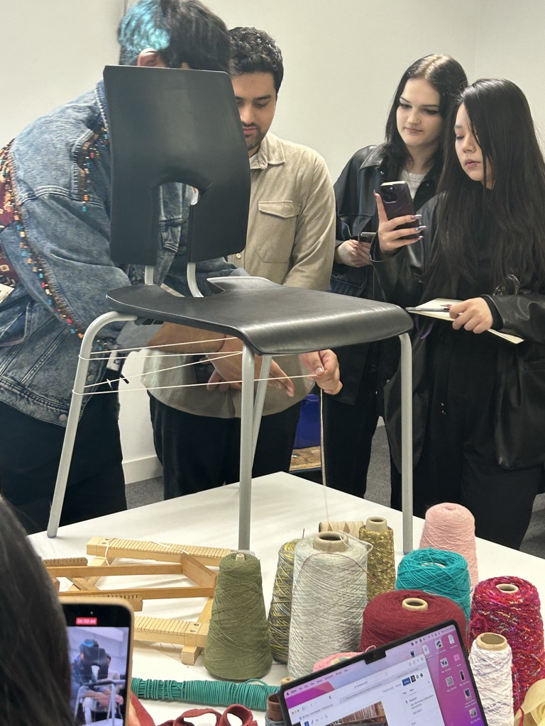
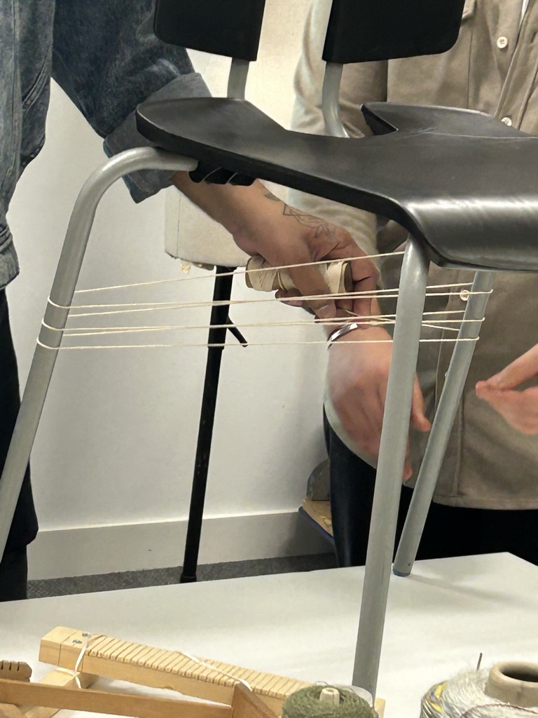
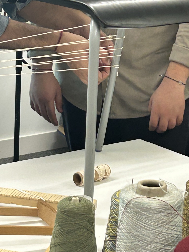
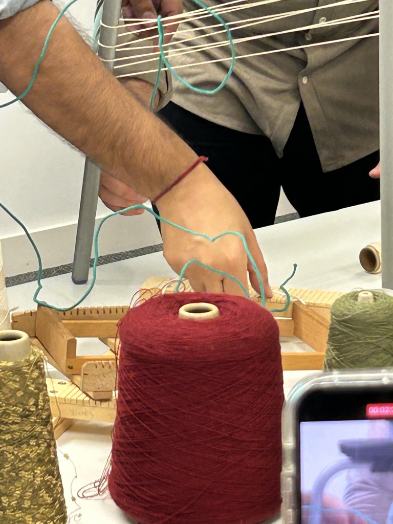
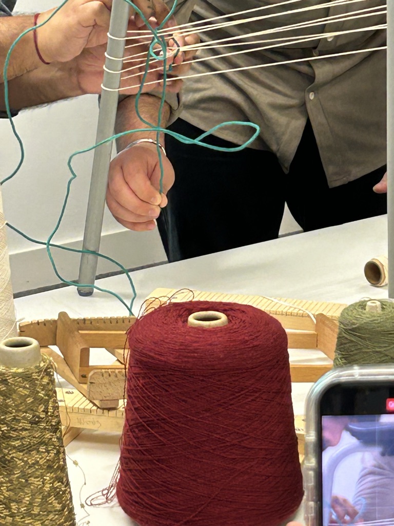
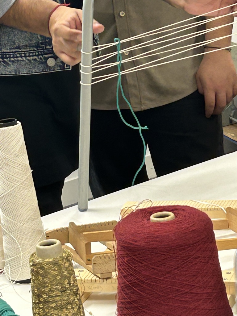
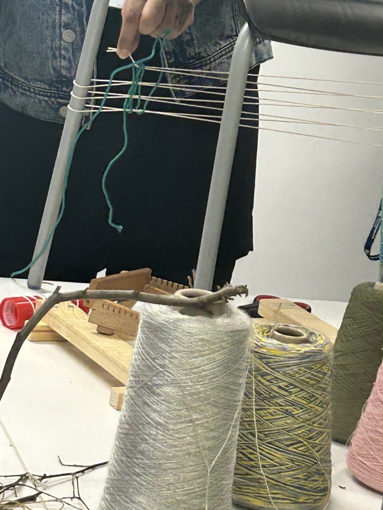
Traditional Waving:
Use the line to make something. They use equipment to make fabric. Interlaced lines can make different patterns.
Morden Wacving:
People use modern equipment it is very faster to make the fabric.
In class, we use a chair to try to do the traditional waving. It is a interesting experience, although it makes people crazy.(me)
Material experiment:


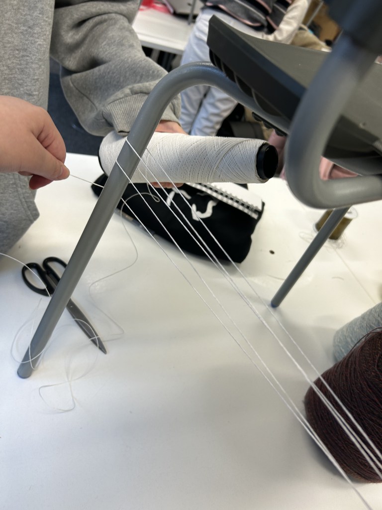


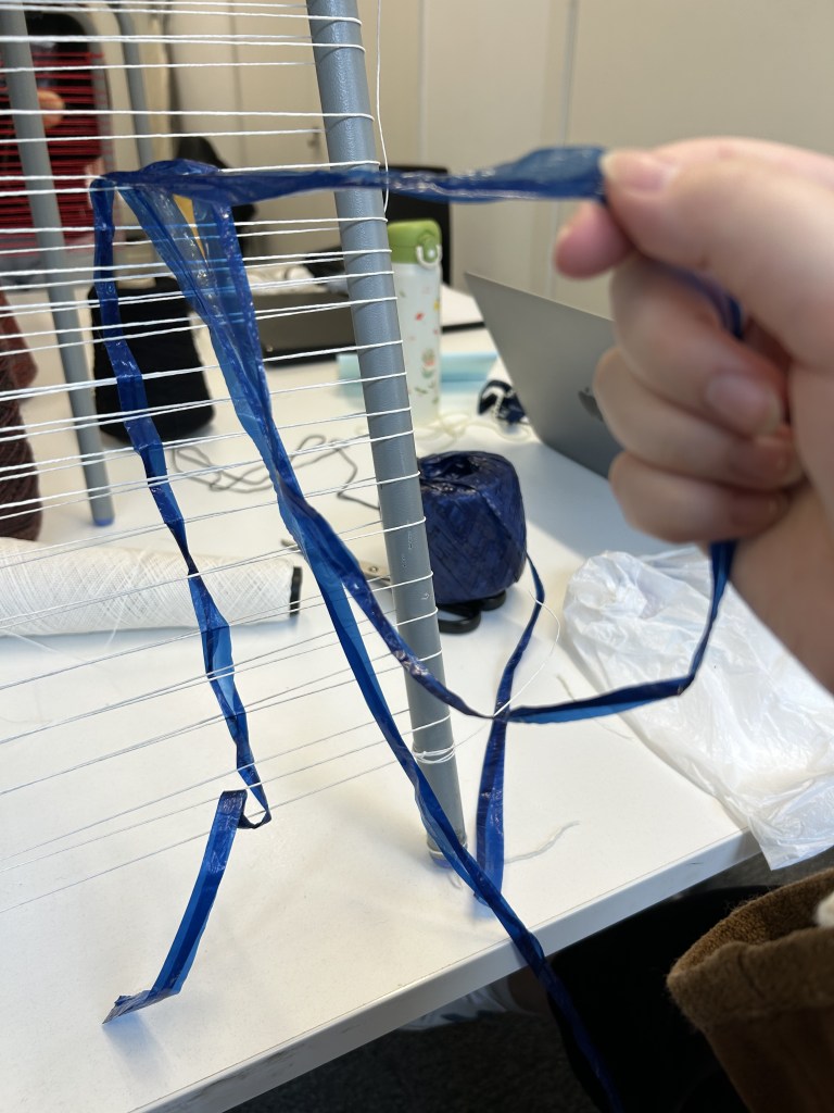
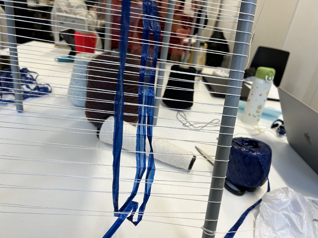


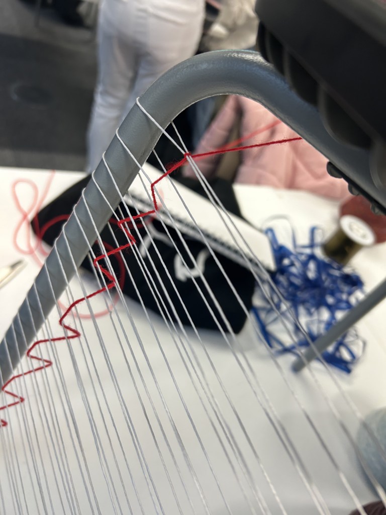

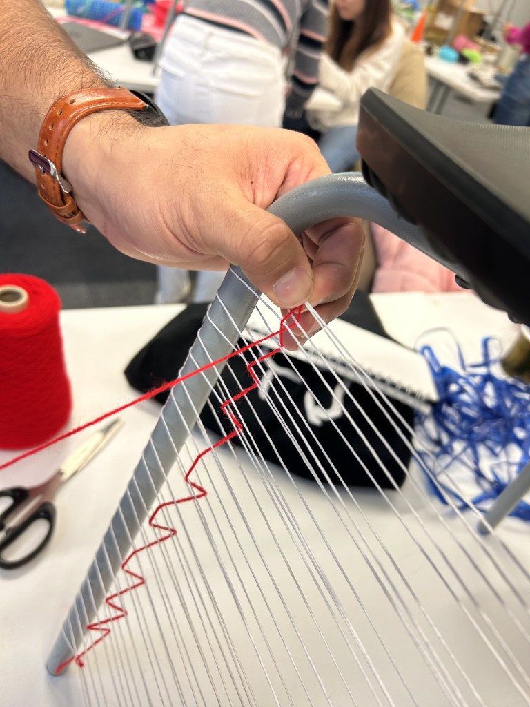
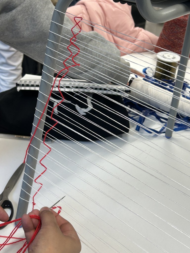
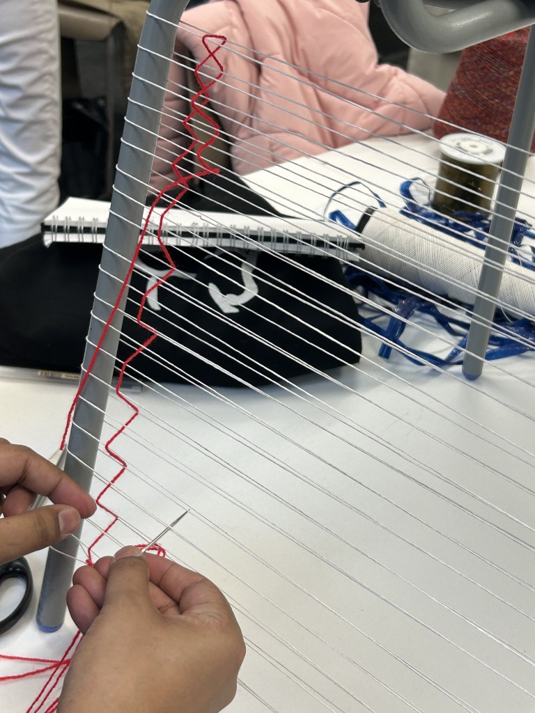
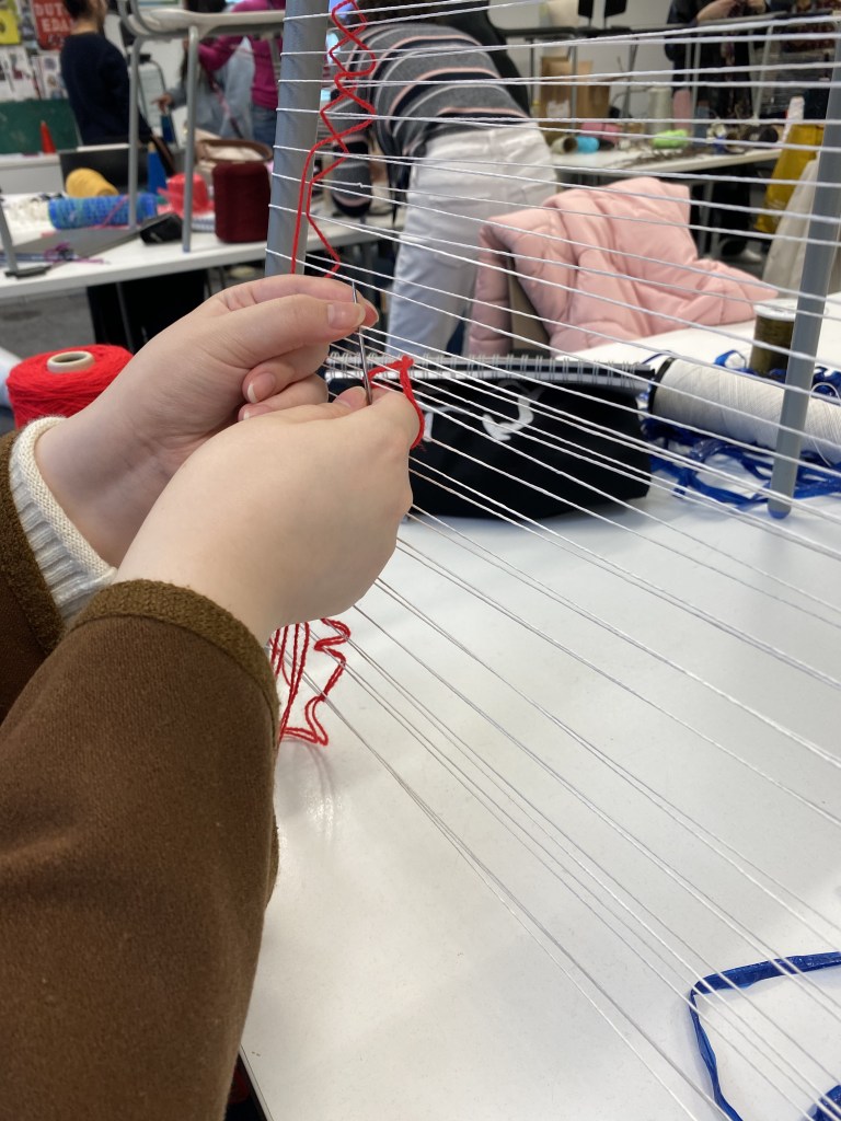

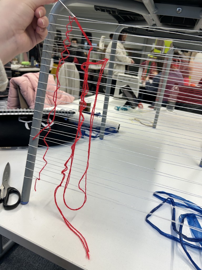


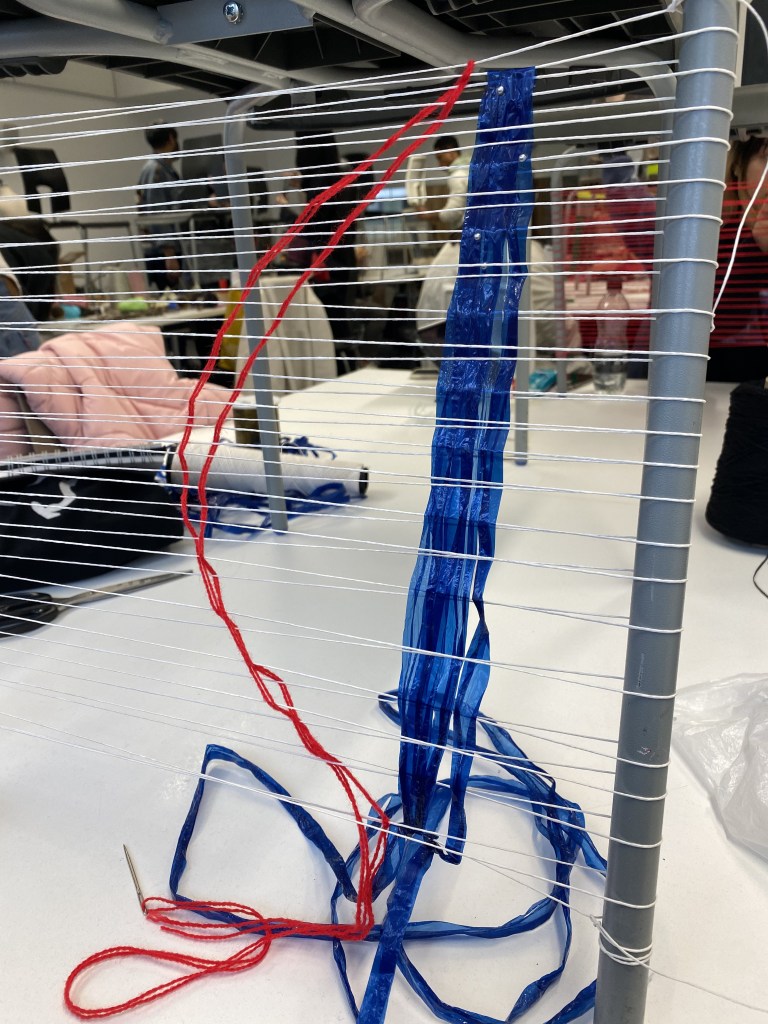
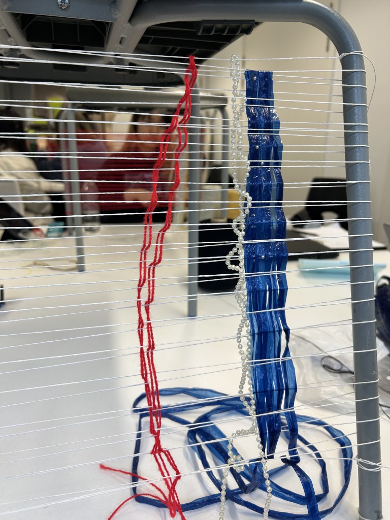
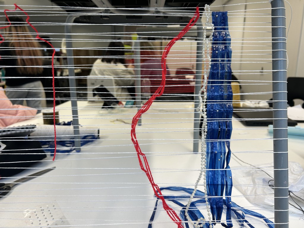
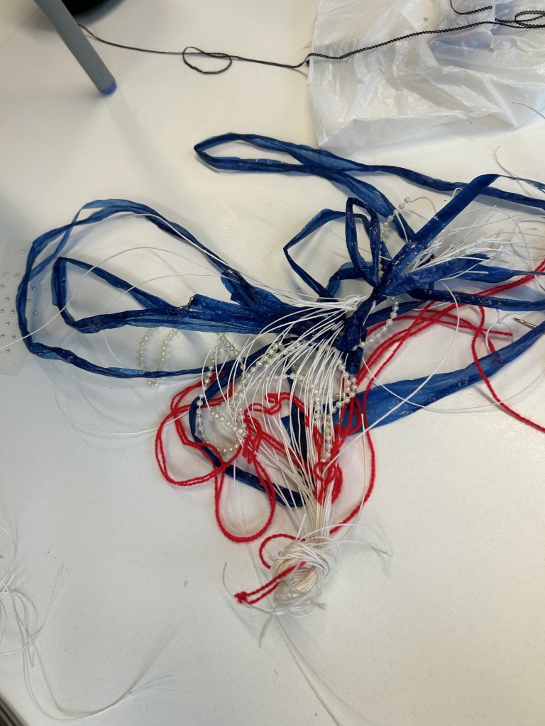
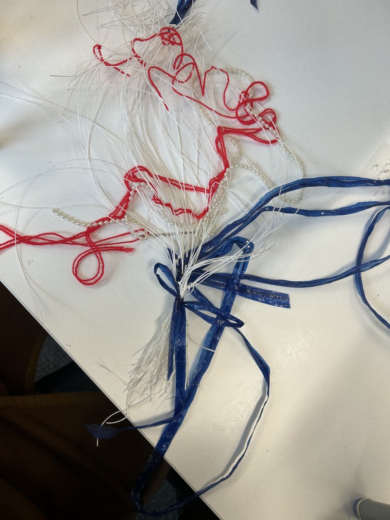
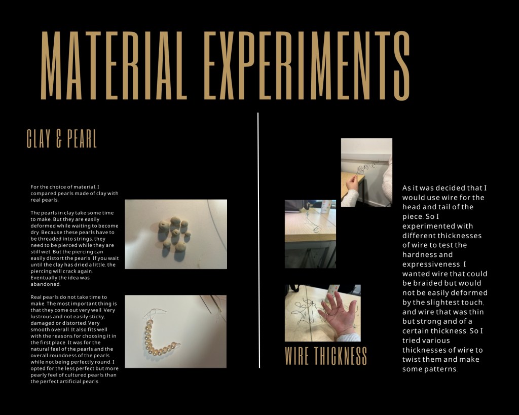
In this class was a very important learning and experimentation process for me. I learnt about the traditional preparation process. And to prepare it with different materials. We chose to use red and blue plastic threads and pearl stickers. When I put the pearls on I found that the traditional weaving was very interesting and went very well with the pearls.
This inspired me to think about the form of the pearl snake’s head for my final work. Now I’ve decided that I’m going to use fine wire in the traditional way.
Modeling research:
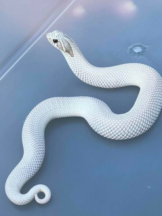


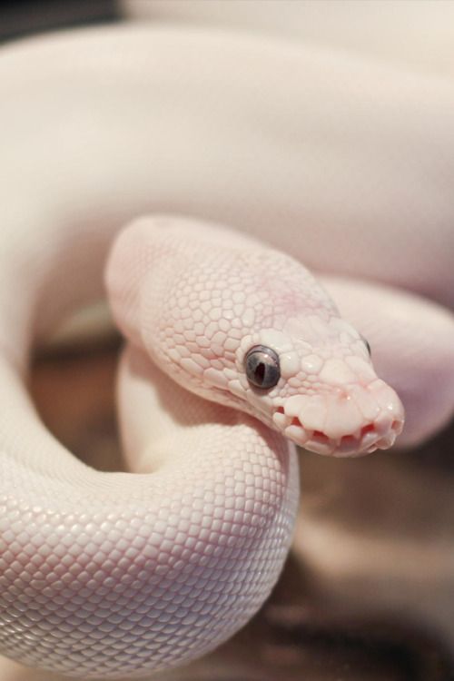


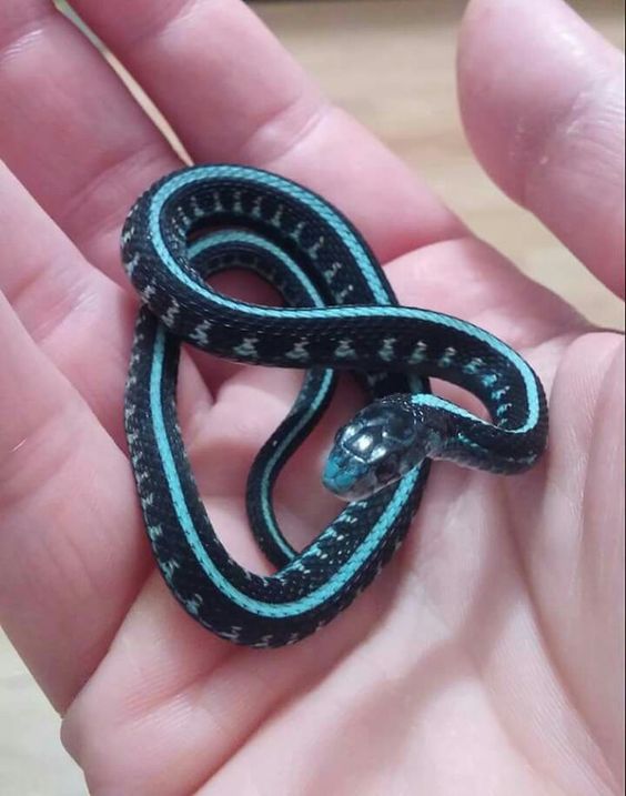


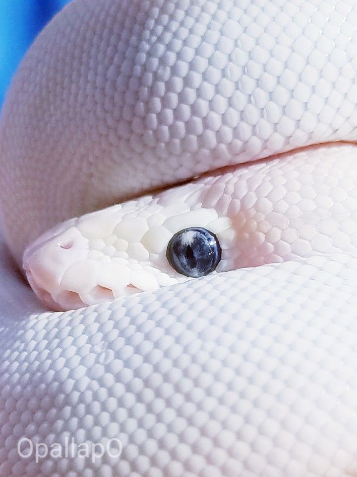

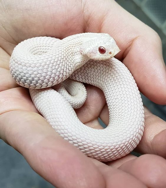
I searched for images of snakes in order to determine which type of snake I would like to favour for the final working snake. These were also the models that I would use for my sketches. Although the necklace was originally inspired by and named after the blue-eyed Lucy strain of the ball python, the ball python is a bit more bulky. However, the ball pythons are rather bulky in shape. The decision to use the Colubridae was made through observation. This snake does not have a clear symbolism, unlike the cobras, and its long, slender body and even proportions are more in keeping with the image of the snake and the pearl chain.
Material experiment::


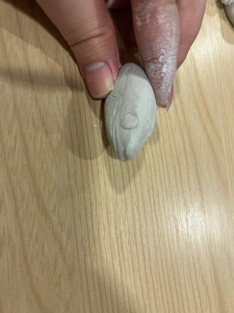


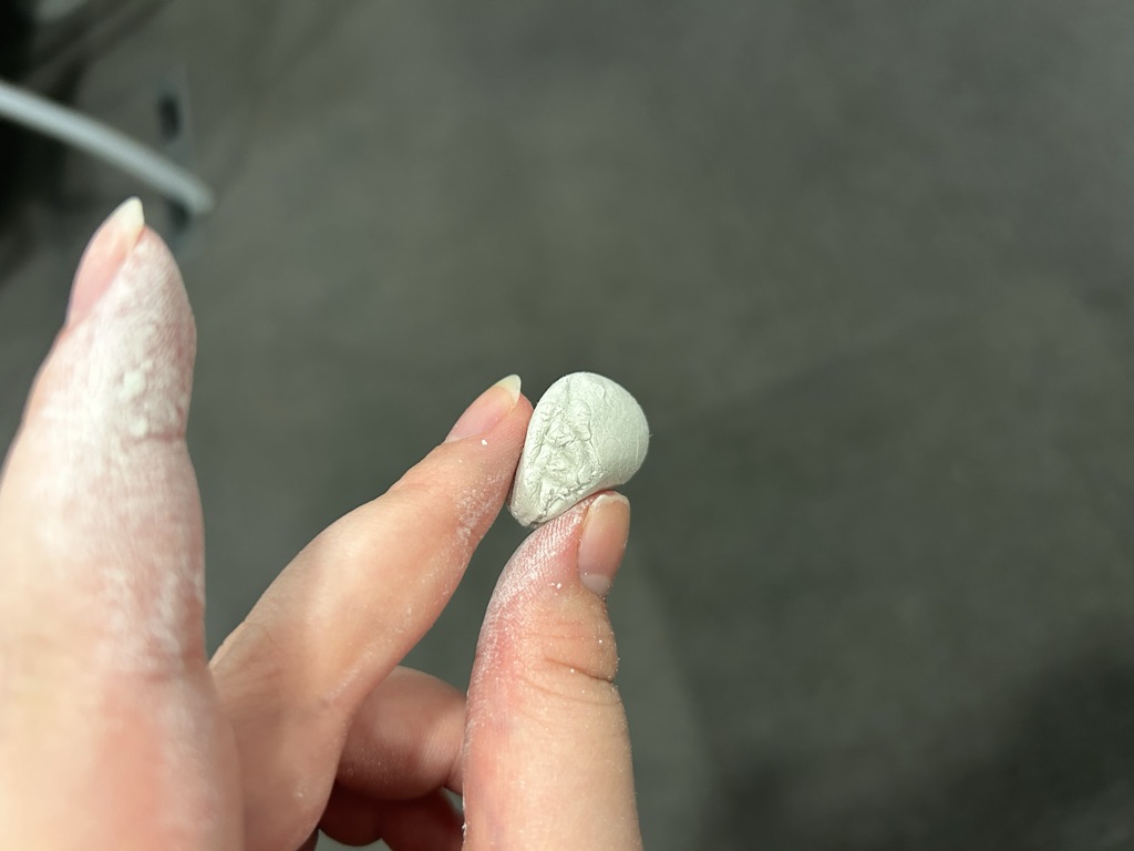
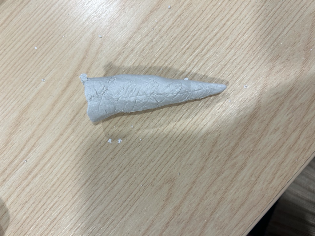


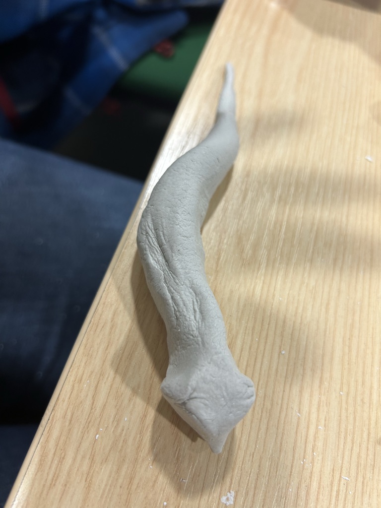
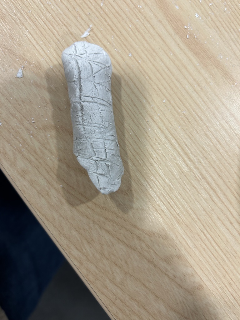
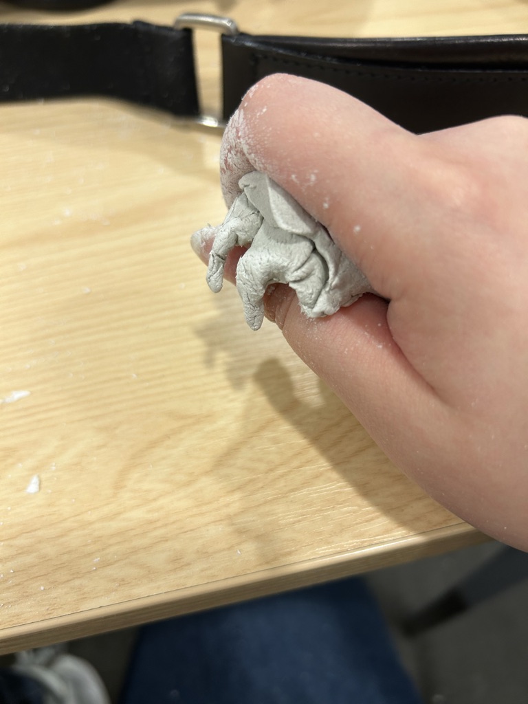


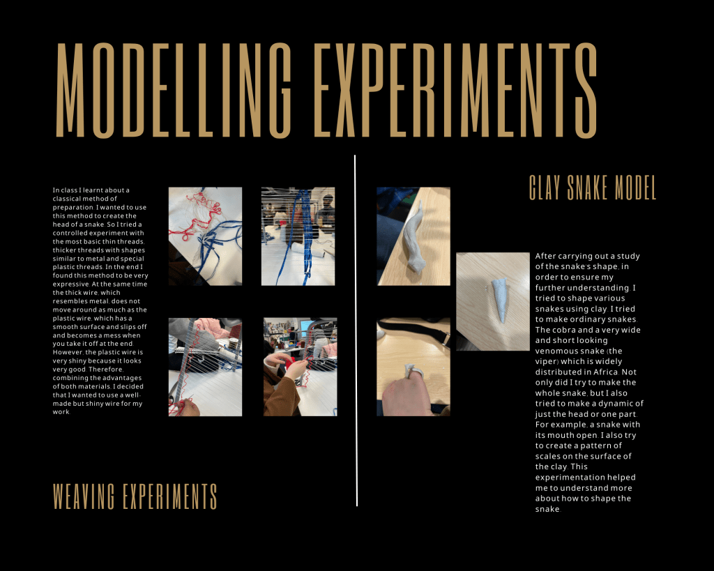
In this lesson I need to make pieces using clay.
I want to make models about the final work. So I chose to use white clay so that I could see the shape of the model to the best of my ability.
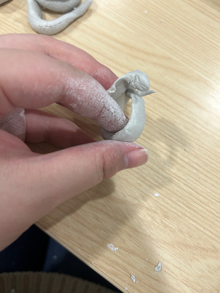
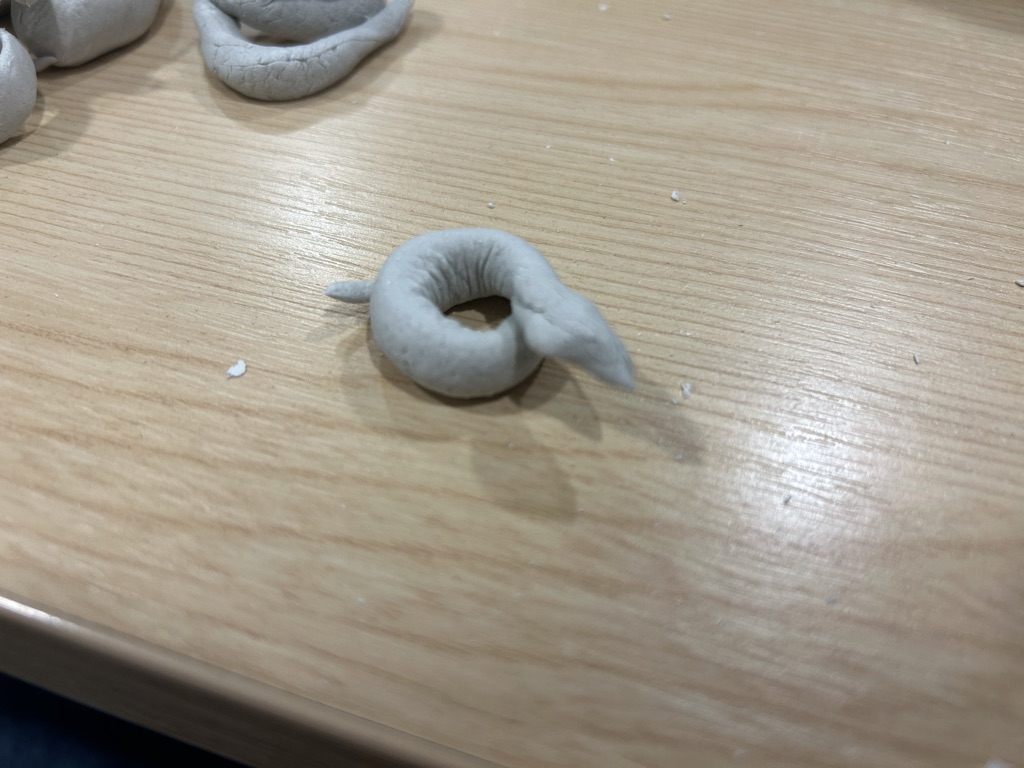
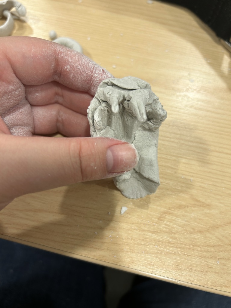
My final work is related to a snake. I want to make a snake necklace and so far only the body of the snake has been identified using real beads. But neither the shape of the snake’s head nor the proportions of the snake’s body have been decided yet. In the end I decided to use clay to help me make a quick and clear comparison of the image of the snake I wanted to refer to.
I made several different snakes, and the most characteristic parts of the snake, from photographs of the different species I had researched in the previous lesson. For example the full body of a colubrid and the head of a cobra. The full body and pattern of the African viper. The eggs of the snake. Venomous teeth and mouth, etc.
In the end I found the cobra to be the most attractive and so I made the ring with the image of a cobra.
Unlike the cobra, the colubrid is the most smoothly charming and universally appealing snake overall. I used them again for comparison and finally decided to go with the colubrid as the main element first.
I think making models in clay is a very in-depth and quick way of helping myself understand the form I want to compare.
Task:
My work:
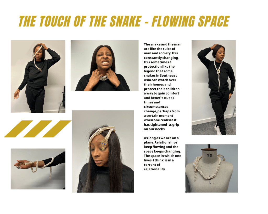
This piece is a pearl necklace inspired by the word ‘space’, a derivative of ‘structure’. Through this work, the creator demonstrates his understanding of the relationship between social rules and people, which is variable.
In terms of the internal conception of the work, the rules of society are generally intended to be a mechanism to help people achieve greater benefits, but as time and space change the rules may become more constraining or even harmful to people so that the benefits outweigh the disadvantages. Time and space are almost always changing, so the relationship between people and rules is also constantly changing.
Externally, this ever-changing relationship is like that of a human being and a snake. This was my inspiration for the shape of the necklace, which I wanted to make in the shape of a snake. Snakes are often a source of crisis and constraint for those who don’t know them, and one always associates them with strangling their prey. On the contrary, in some countries, the snake is also depicted in legends as a guardian and protector of the family. This corresponds to the sense of bondage and the benefits and even security that rules bring to people in different spaces and times.
Finally. For the snake necklace, I chose pearls, a material that has been observed to be very versatile in all Jewellery. Pearls are available in long, loose chains or as chockers that fit perfectly around the neck in multiple loops, and many pearl necklaces allow the wearer to adjust the length and the number of layers themselves. This versatility is very much in keeping with the changing relationship I wanted to express.
References/inspirations/influences
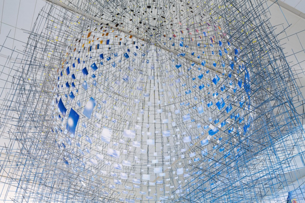
This work was influenced by the installation artist Sarah Sze early on in its conception. She is an artist who is constantly exploring the world, while her work is consistently beautifully constructed and rich in her choice of materials. Many of her works can be viewed through different angles and different facets of the piece can be seen. The flexibility and expressiveness of her work have inspired me to want to make work that can be varied and relational.
I will then introduce and analyse it in four points: style, materials, sense of space and ideas.
Style:
Sarah Sze’s style is very special. Her visual art seems to possess a language. She has said that it is a futile quest for fragile wonder. Her work has always been innovative and experimental, ‘Since the late 1990s, Sze has created intricate assemblages of everyday objects that blur the boundaries between ‘Since the late 1990s, Sze has created intricate assemblages of everyday objects that blur the boundaries between painting, sculpture, and architecture.’ Her style is one of constant innovation, using a variety of materials to reconstruct her perception of the world. Through constant experimentation, she seeks to make sense of the world. Materials, ideas, and materials change with experimentation, but only her eternal quest for the truth of the world remains the same. This infinite quest for nothingness gives a vast experience of infinite forward beauty. This is precisely why almost all critics would comment that her work possesses a sense of grandeur. This article will then list the materials Sarah Sze uses to express her sense of space and ideology.
Materials:
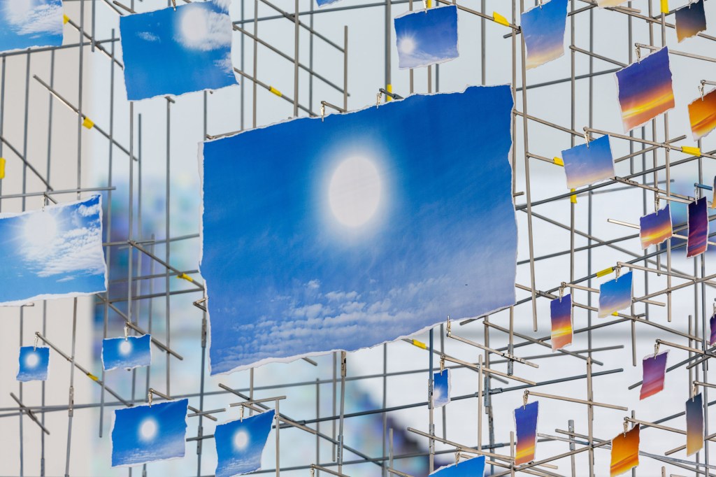
The choice of materials is often driven by the artist’s need for expression, and Sarah Sze tends to use a variety of materials and media to express her ideas. Her choice of materials and the way she uses them is quite subtle. As Bruno Latour puts it ‘Sarah Sze gleans objects and images from the worlds both physical and digital.’ She specializes in constantly jumping between the macro and the micro, delicately using complex three-dimensional structures. She therefore always uses a large variety of materials. The almost metallic sphere of “Night today”, for example, is driven by an exploding line of wooden structures reminiscent of the Big Bang. Destruction, creation, kinetic time, and many other words close to the roots of the world. It is like an exploration of the beginning and end of the world, and like an eternal question to the viewer. She is good at making sharp, clear work out of hard stuff. Of course, she is also very good at making complex and ornate works from more soft or not quite firm and not quite soft enough wire. It’s like a space where time and matter are in complete chaos. “Hidden Relief” is just such a piece. It is made using a great variety of materials of different textures. It uses wire, silk, 3D printing technology, acrylic, light, and shadow effects, and so on. It expresses a room that is hidden in chaos with a touch of order. It creates a sense of peeking through various-sized gaps. Because of her rich and diverse forms of expression, her choice of materials is also rich and delicate. In ‘Shorter than the Day’, she uses several photographs of the sky. Many of them have the sun or sunlight in them. Sarah Sze is flexible in her choice of materials, which makes her work even more attractive.
Space:
The subtle sense of space in Sarah Sze’s work has been mentioned by almost all critics. This versatile sense of space allows for the possibility of multiple interpretations of her work. For its works are usually three-dimensional, hollowed-out wholes made of something. It is therefore possible to understand different things through different perspectives. The delicate spatial variations brought about by this beautifully massive structure make this work very complex and worthy of contemplation. Again, the example of ‘shorter than day’ is used. As mentioned above, this work looks like a huge sky. The structure of the metal bars and the photographs of the sky at different times of the day give a visual impression. However, if the distance is increased and the perspective is changed, the result is much different. If one is far enough away, the structure becomes a suspended spherical object, like the earth. The blue sky photo looks like the part of the ocean in the Earth at a distance. Likewise if you get very close, each photograph is still a kind of time period of the sky. If someone, as a viewer, were to look upwards from far to near as the structure rises, they would feel the time of day draining away at the speed of light. The changing structure interprets the work in different ways.
Sarah Sze’s thoughts and everything she shows in her work is informed by her own words – ‘I’m trying to find the moment that feels volatile or live …’ Her work has a constant sense of upward mobility in terms of style, choice of material and structure. The powerful sense of flow that can be felt in her work is very much linked to her ideas.
Thoughts:Sarah Sze’s thoughts and everything she shows in her work is informed by her own words – ‘I’m trying to find the moment that feels volatile or live …’ Her work has a constant sense of upward mobility in terms of style, choice of material and structure. The powerful sense of flow that can be felt in her work is very much linked to her ideas.


Reference:
Ebert, G., 2020. Fundreds of Photos of the New York Sky Are Pinned to a Massive, Spherical Sculpture by Sarah Sze
[WwW Document]. Colossal. URL https://www.thisiscolossal.com/2020/06/ sarah-sze-shorter-than-the-day/
(accessed 2.24.23).
Sarah Sze [Www Document], n.d. . Victoria Miro. URL https:/ /www.victoria-miro.com/artists/ 33-sarah-sze/ (accessed
2.24.23).
Sarah Sze [Www Document], n.d. . Victoria Miro. URL https:/ /www.victoria-miro.com/artists/ 33-sarah-sze/ (accessed
2.24.23).
Sarah Sze, Night into Day [www DocumentJ, n.d. . Fondation Cartier pour I’art contemporain. URL
https://www.fondationcartier.com/en/exhibitions/sarah-sze-1 (accessed 2.24.23).
Williamson, B., n.d. Sarah Sze IWww Document]. URL https://www.studiointernational.com/index.php/sarah-sze-
Final work intent:
Mind map:

Task:
Draft:
I have created 20 drafts of snake related jewellery belts etc. As well as structure-related jewellery objects, and drawings. Finally, I also made a few drawings to record my own thoughts and feelings and my state of life.
All these things have their roots in Identification – structure, and it goes without saying that the structure-related jewellery paintings are a very direct link. The snake related ones are derived from the final work on the changing space and the changing objects such as snakes and prey. And finally about the structure and documentation of life, these are the first few that I started with when I was working on the 20 drafts. I believe that everything is inspired by life, so I wanted to write down the feelings I encountered in my life first. This will then lead to the most straightforward structure-related pieces, and the more developed snake-related decorations.
About snake:

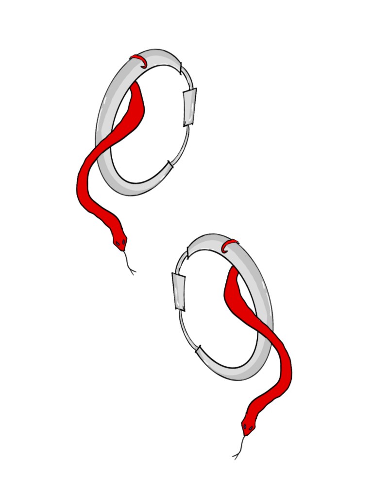

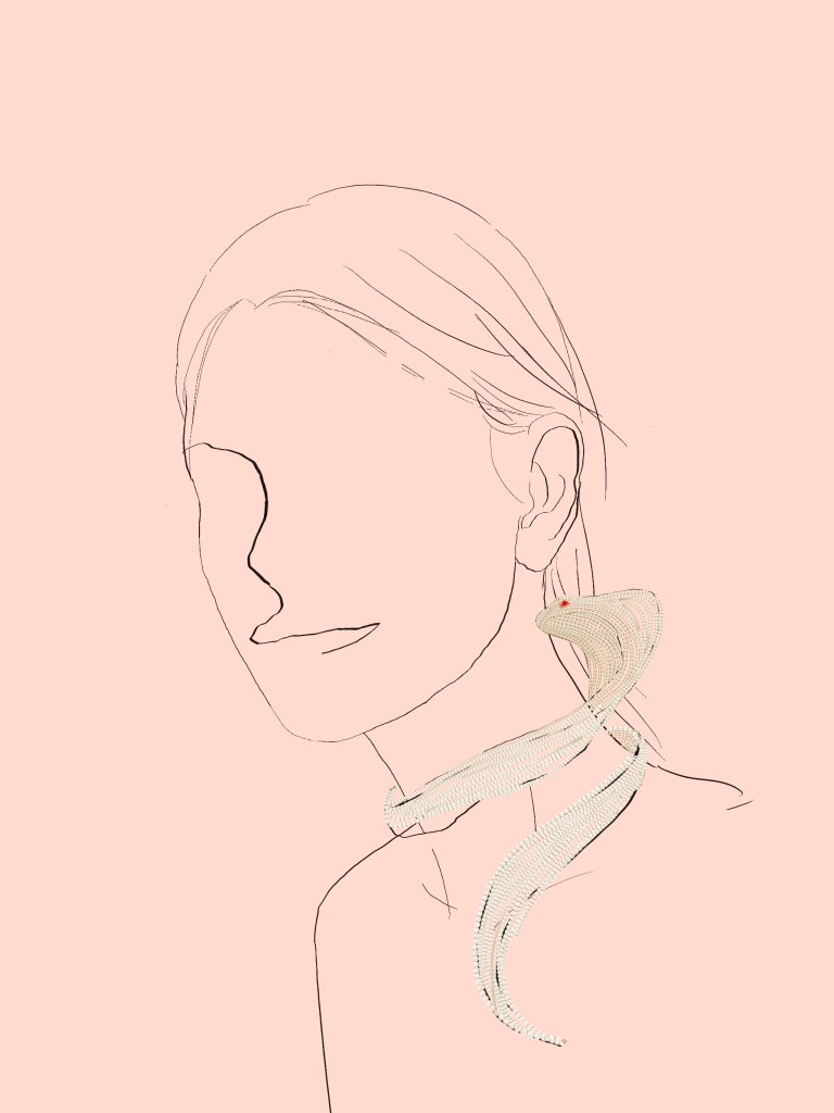
- This pearl snake necklace is strung entirely with pearls and embellished with two rubies. To give the snake more dimension, the thread used to string the pearls is of a harder but less permanent crease material. The main source of inspiration for this connection is the cobra, a reference to the way the cobra stands up on part of the Egyptian crown. While people generally like to use gold and silver for snakes, I wanted to experiment with pearls, an uncommon pairing. I thought this blend might be a classically expressive piece.
- This is a double ponytail hairband made of metal. The double ponytail is something that is very important to me as a symbol of my desire to follow my heart. I used to have them when I was a child, but my father said they didn’t fit and didn’t look good. I think he was just saying that, but I really never used it again. It wasn’t until I became more self-conscious around the age of 18 that I wore it again. It was only after trying it that I realised it was just a haircut, but it was more fun to do it because I wanted to do it than anything else. Afterwards I realised that this kind of haircut seems to have been worn by very young and cute people, usually with cute bows and ribbons and lace. So I wanted to create something other than a cute hairpiece. I thought that snakes and metal might be a good match. That was the reason for creating this piece. I also chose red because it has a sense of power and life, and it is also a more powerful and present colour than green.
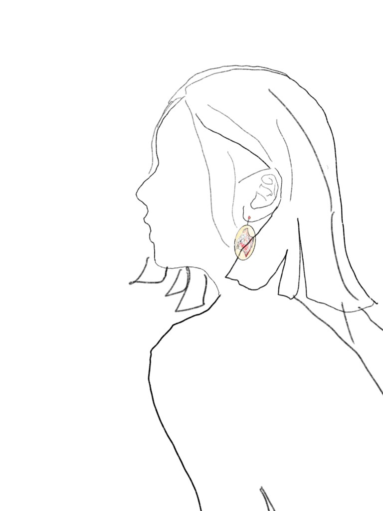
- The necklace with the snake’s egg is still inspired by snakes. I think the birth of a snake is also well worth recording. The birth of anything is very life-affirming. Especially the snake, whose egg is ivory-white and slightly longer than an egg and looks very clean. At the same time there is this blood-tinged mucous membrane inside, which gives a real sense of being alive. Snakes are variable and you never know what they are going to look like until they actually break their shells. I therefore see it as a symbol of vitality, which I wanted to document in the form of jewellery. In terms of the illusion of a visual-auditory connection, it seemed more interesting to have the sound of life breaking apart as an earring, as if it could be heard, rather than a necklace, for example. So in the end I chose the earrings.
- The Tree Viper Snake Bracelet is a bracelet I wanted to make from cardboard, inspired by Japanese origami. This layered look is very fine. The colour of the paper can be as bright and beautiful as the tree viper’s outwardly curved scales. It even has a childlike and light feel to it. It is the most different part of the piece that I have tried compared to the previous ones.
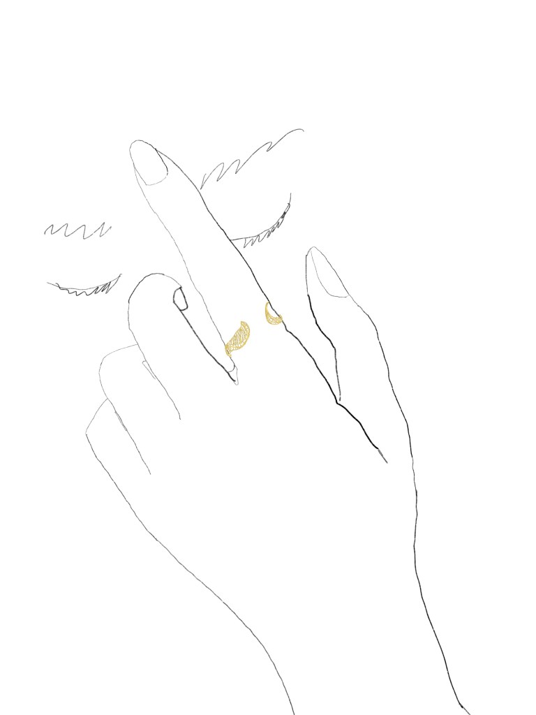
- Gold wire woven pig-nosed snake ring, my draft of this design is a ring woven with gold wire. This craft can be seen in Chinese European Turkish jewellery and furniture. I think it is very present and expressive, but has a lighter and less heavy expression. It suits the pig-nosed snake, which is a relatively small type of snake among snakes and has a very cute face. Also the golden weave is a similar design to the head of the snake I envisage in my final work. So I drew it out as an experiment to make sure the final design was suitable for this kind of expression.
- The belt of the snake, which draws on the golden ratio. It is engraved in sterling silver. This piece was the last of the snake related pieces. The intention was almost entirely to express the graceful curves and flexibility of the snake. It was therefore decided to make the snake coiled in the golden ratio. The simplicity of the material also helps to make the pattern of the belt a real point of interest.


- When it comes to things related to structures one thinks of churches, and this painting is inspired by church windows. Like the shapes of the mountains and the sun, the simple black and white is reflected in the windows. The irregular geometric shapes are at once like the landscape outside the window, like the window flowers on it, and like the broken glass itself. I find it fascinating that the structure allows for endless speculation. And this work is about capturing that conjecture in a partly figurative matter.
- Baboon’s Face, which is a geometric drawing of my baboon’s face. The difference between the realistic style of the drawing and that of the baboon may not be immediately apparent. But I did exaggerate to the maximum and show my perception of a baboon. The huge head and the forward leaning jaws. 3.
- Geometric collage bag, inspired by Picasso’s violin collages. I think geometric shapes and collage are expressive. So I wanted to try to make a handbag in this form. In fact it’s more like a poster for a handbag. I wanted to represent a state of irrational heterogeneity in which different structures are put together. 4.
- For the structured necklace, I would like to make it out of clear glass or acrylic. Maybe just glass from a wine bottle. The structure is a state of superimposition. The superimposed combination of one’s own lines and the lines of the human body into a new visual experience. It is created to change a structure. I think I could also try experimenting with changing the material to concave lenses etc. afterwards.
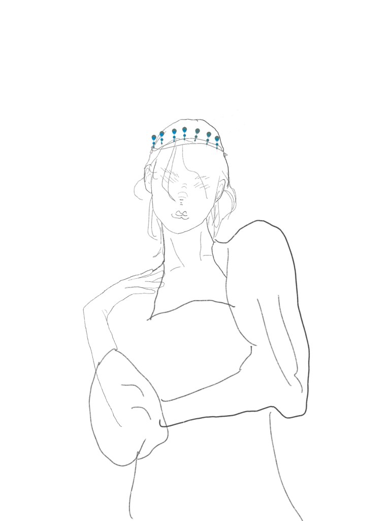
- Downward Drop Crown, which is a drop-like crown. I wanted to show the danger of right. Beautiful and dangerous. A heavy right and the very few people who bear it, so that it appears fragile. But a right that is separate is not a right. I wanted to show my understanding of rights with this fragile structure.
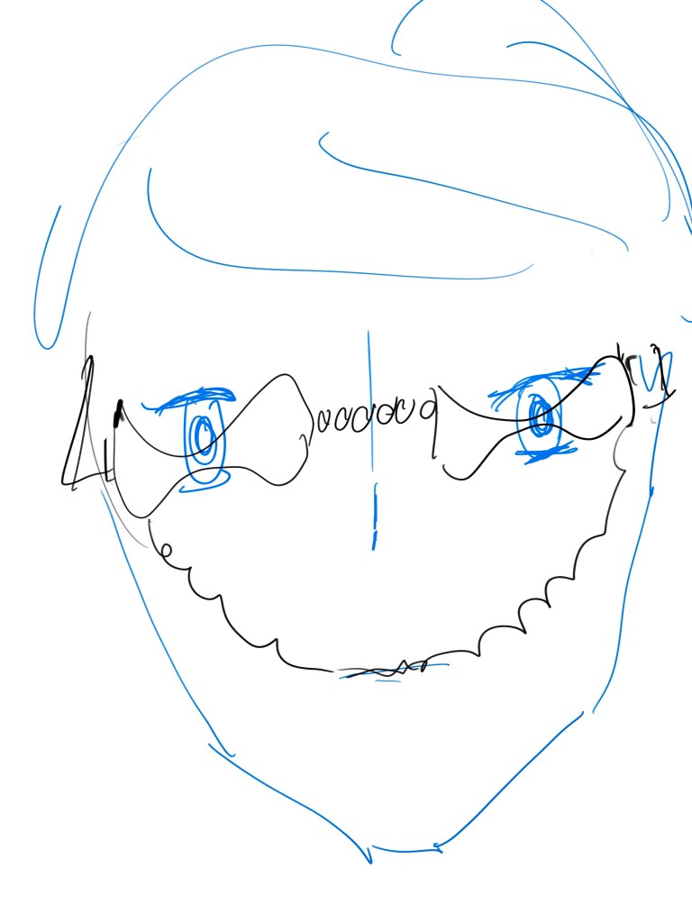
- presbyopia, which is my visual fantasy of growing old. I don’t think getting old is scary because there is no dead old age is the way to go. It’s just interesting, unlike nearsightedness where you can’t see things up close when you’re old. It’s like aging and becoming distorted. I wanted to use this distorted presbyopia to show my delusion about the process of growing old, especially how my eyes feel.
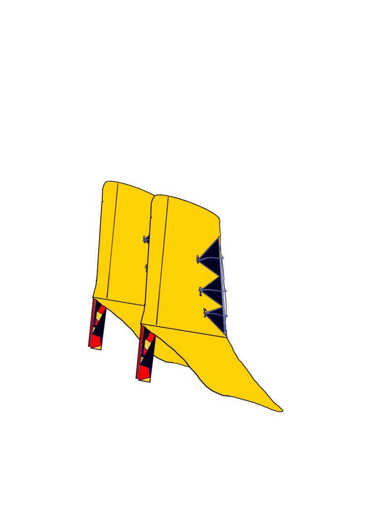
- The boots, the colour scheme is inspired by the common colour scheme found on Bauhausist posters. That is, yellow black red and white. I wanted to try and create a shoe in this colour which is full of structure. It was more like incorporating the Bauhaus style into this creation. At the same time it adds my own personal touch, which is a tight, irregular and irrational structure. One can feel it in the heel part of the shoe.
- Waking Dreams, which is my structural representation of what a waking dream looks like. I see dreams as a means for people’s subconscious to peer into themselves and the world. At the same time realistic feelings and fantasies are the triggers for dreams. So the dream is a piece by piece and incomplete. At the same time it is very confusing and yet seems to have doors and windows. It seems to lead to something unknown. At the same time the dream is coming to an end when one realises that one has really seen the irrationality of the dream. I then wanted to show this moment of feeling. This structure and consciousness that is about to shatter.
- An old photo installation, this is a white room. The room has a number of movable mechanisms. The mechanisms have small grey and white balls of different colours. People who pass through this room are sure to leave their mark. When they leave the room they will have a look. The change of the little balls is the trajectory of people’s movements. I think it’s like an old photograph, a fine pixelated record of the emotions and tendencies of things released in a moment. That’s where my inspiration comes from.


- a drowsy view, I wanted to convey that feeling. In the trance the world is gradually becoming darker. The lights reappear in front of the eyes from other angles. The rotation of space remains fairly intact, a sign that consciousness is still present. But the black lines before my eyes are again oppressive, making it too inconspicuous. This exhaustion is the emotion I wanted to record from the previous period.
- illness and me, which may be the new self-portrait may have taken inspiration from Frida’s self-portrait. I also wanted to try to draw myself in relation to my illness. My illness is neither curable nor life-threatening. It’s both mentally draining and not to the point where I can just rest in bed. It’s really interesting. Whenever this illness strikes I feel their life force like rolled up grass, wild flowers in full bloom. Like ribbons dotting my life, moving forward with time. And I would get the emotions I only get when I’m sick, uncertainty and confusion and stagnation.
- The glass is broken and this is the installation I want to make. This is my observed emotion and not my own. Some people’s emotions don’t come out all the time, they accumulate. Knowing that an outburst, like a broken glass is bound to destroy something. They seem to restrain themselves, but then they seem to be less than unknowable. At the end of the day it’s just tragedy and welling up of emotions.
- happy snail paradise, I see snails as a symbol of boundary breaking. Just a sprinkle of salt and they melt into water and don’t maintain their form. Whereas people and many things cannot do that, we all seem to be limited by something, or can only observe the world within this limitation. This is very safe and reasonable for the mind. But I think it must be fascinating that even the boundaries of existence can be blurred. This is exactly what I wanted to show.
- coral bunny. This is a rabbit with furry coral antlers. It was the first character I designed this semester. Coral bunnies are non-threatened creatures, but are rarely observed and no scientific classification has yet emerged. It has a beautiful head but runs fast on its feet and no one can see its lower half yet.
Two drafts will be developed down:


Develop 10:
Five wrap-around jewellery pieces developed from the pearl cobra necklace:
Original version:
5 structural device related dispersions:


This is the most satisfying of the snake ornament sections that I have selected from 20 drafts. After drawing this cobra pearl necklace I realised that jewellery that could be wrapped around the body seemed to go well with animals and snakes. So I did five more drafts of the same theme.
- This is the pearl + wireworm pairing. It is a version that replaces the snake. Because the wireworm has the ability to suck up nutrients, it just doesn’t look good and really looks like wire. So the chain was changed to cover the pearls to give it that binding feeling of sucking up nutrients.
- Silver wire necklace. This is a design that completely emphasises the wrap and the fit. I think silver wire is perfect for being worn in the traditional ethnic jewellery and costumes of a large part of the peoples of this planet. Silver is a soft material and the slim wire will fit very well around the neck. It emphasises the beauty of the body’s curves and the simple curves of the silver wire.
- The blue snake armlet. I think this would be an enamel texture. It is a reference to the Egyptian and Greek style with a strong sense of coiling. The reason for using enamel is that I wanted the representation to be closer to the snake itself. Unlike the pearls, which are not really similar to the snakes themselves, the enamel has a bright colour and a strong texture. The colour of the enamel is bright and shiny, which is very much like a tropical snake. The main reason for this is to give a more realistic representation of the snake’s scales and bright colours.
- The butterfly necklace, the metal part of the necklace is relatively simple and touches the decorative part of the jewellery by choosing to use a thin chain without presence. This is to maximise the butterfly itself. This time I abandoned the snake and chose the butterfly as the animal. This time I chose to model the butterfly on the very present blue shimmering butterfly and therefore chose blue stones for the accent of the wings. It is more like a human and a snake than before where it was the snake that bound the human and struggled. Here it is more like the dead man and the butterfly that parasitises him to suck the remaining flesh and blood. (Butterflies themselves use dead bodies.) If there is a model, then I would like it to be a beautiful line of corpses. Not only is the elemental relationship line of the animal replaced in this development as well.
- pearl snake necklace + gold silk version. Instead of the original pure pearl material, I chose to add the classic pearl with gold wire. I did this to try and add a sense of strength that snakes are supposed to have, and the texture of the pearls altogether would look too soft on the outside even with the hard thread supporting it on the inside. In terms of the image, the traditional snake image was used instead of the original cobra image. This is because the cobra, although also a well known snake, was often used in Egyptian iconography. It is a symbol of many things, even mythology. I thought it was important to streamline the expression, so I chose to replace it with a more classic but less explicit symbol of the snake family.
Original version:


These five drafts are very closely related to the original version. The first and second of these are both graphic classes of the work as drawn by the person experiencing the installation and looking back at it. Only one is the original, which is also in black and white like the old photograph. The other version is a colour version.
Both are rooted in the original version: An old photo installation, this is a white room. The room has a number of movable mechanisms. People who pass through this room are sure to leave their mark. I think it’s like an old photograph, a fine pixelated record of the emotions and tendencies of things That’s where my inspiration comes from.
I have since developed two more versions of the same concept in jewellery, also to record my own unique trajectory. It is made of a very soft material, so that when one wears it, it is influenced by the state of the skin and the texture of the force that affects its subsequent shape and trajectory. This means that even if the same ring is worn differently by different people, it will not be the same for the same person at different moments. These two pieces are also in two colours, but the contrast seems to be better in black and white.
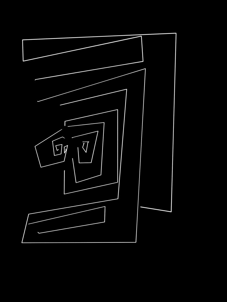
The final piece is based on the movable mechanism that connects the wires and balls in the device. At first I just wanted to draw a plan to see it, but then I realised that it was very much like a labyrinth so I made it complete. I thought the human trail was like a maze, so I drew it. I had been painting in both black and white and after comparing them I finally chose black and white for the last piece. Because I wanted to record, and the tracks are a thing of the past. So in the end I chose black and white with a mechanical feel and a composite past style.
After these 30 drafts were done, I considered this to be an experiment. After the final experiment I think that pearls and metal are the most compatible pairing. Subsequent works will continue in this pattern of materials.
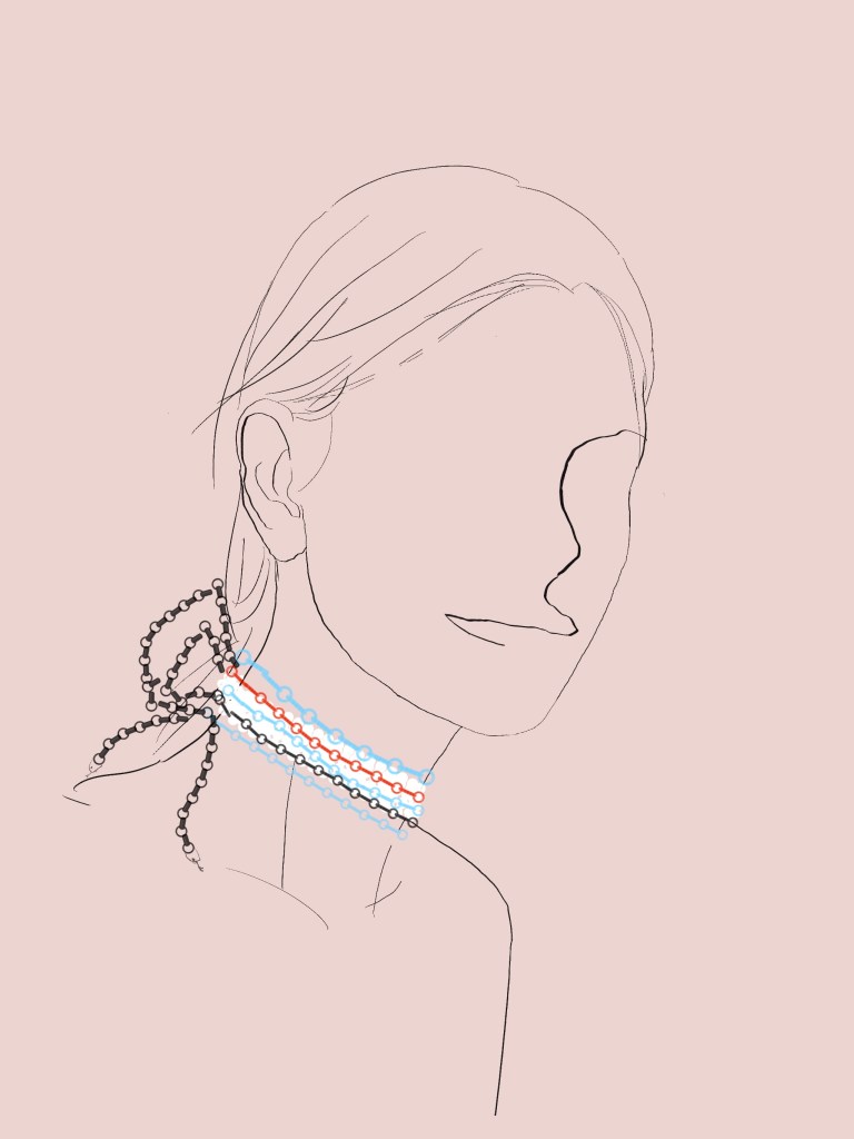
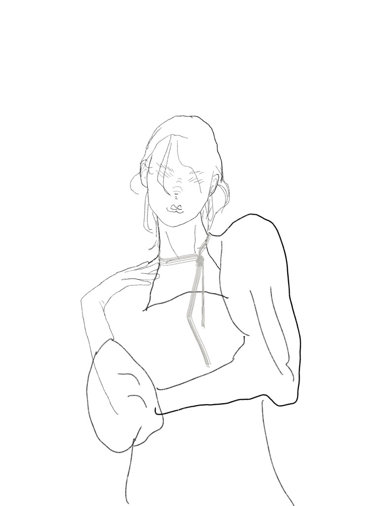
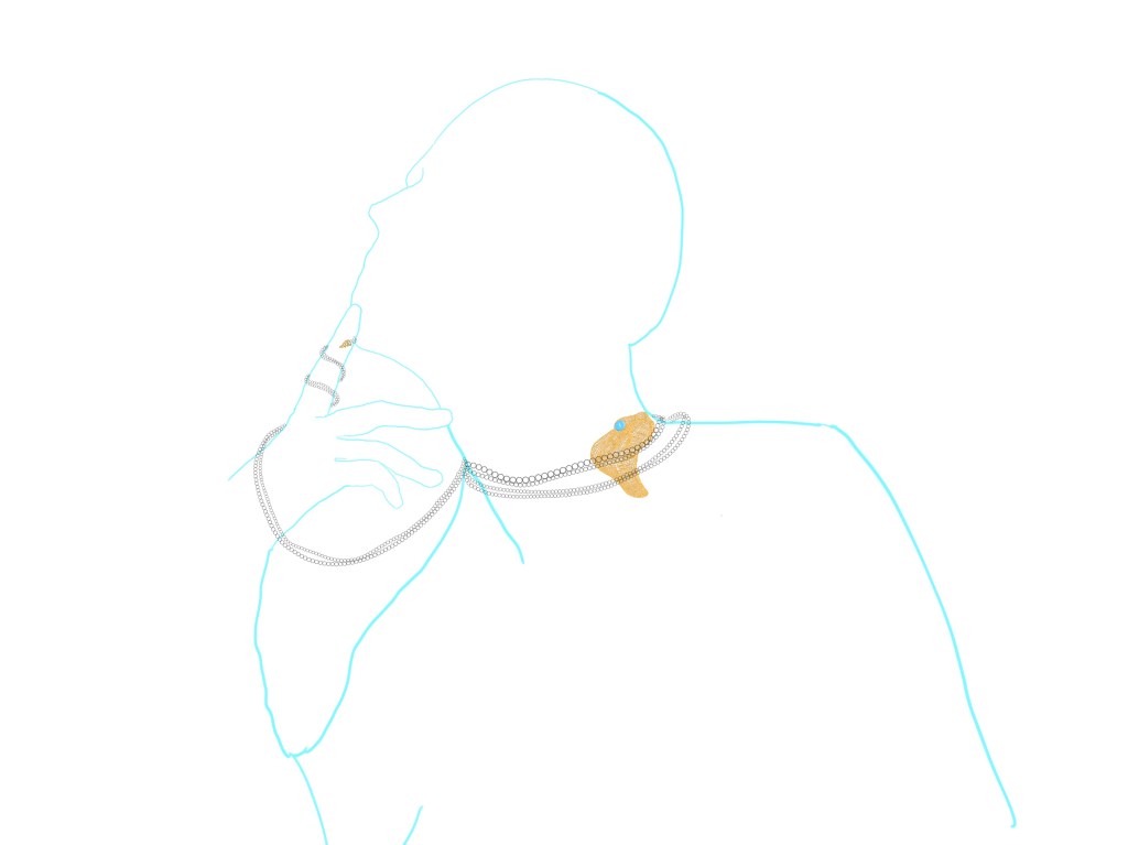
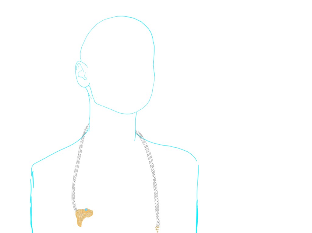
In this lesson I drew up a specific design. The complete snake jewellery structure and the model showing the different effects created by the different ways of wearing it, respectively. I wanted to be able to clearly wear the piece I wanted to produce as mutable and understandable, and its changes would bring about adjustments in meaning. In this way it is an expression of the variable structural relationship between power and humanity.


Design sheet:


Cover sheet:
Power point:
