
SWOT
I strength to analysis my work, and conversation with other. So, when we do some group work, or talk on artist. I went well. Like, when we talk a artist. I prefer to think artist experiment, childhood, thinking model and so on. I often want to talk with each other and change idea. They help me know more angle of one thing. In addition, in this module I study how to critical, and diversity analyze art and artist. Just think is not enough, process or materials are important too. When I talk with my classmate, I always be enjoyed. The reason is I like change idea for each other.
I have weakness in last semester too. First, I do not enjoy about some work I need to write. To be honest I do not like the first research. I think maybe because in first research I do not have some achievement. I do not want to do something, so I have no need for first research. Except my interest, my write skill is not good too in the research. Because, in last semester. I am unfamiliar with the format required for reference, and often use the wrong format for reference. I think I need Look more at the format requirements to avoid wrong quotes and various digressions.
In my mind, I have predicted many places that can be improved. Firstly, like I said examine serious is important. I can write outline primary; it can help me know what I want and need clearly. Then, I want to develop the connect with my work. In last semester I do a part research are not suit for my final project. Just because this place needs a research so I do it. I think the reason is I do not know the clearly aim in my final project part time. So, during this time I just can do some ambiguous research. So, in this semester I will make sure my final project be clearly first, then I will research. And I think I need improve my English skill. It can help me write well. I think I can try to make the word bank to record some word. In especial, the word bank should focus on some professional word. It can help oral presentation too.
When I study in art 101 last semester. I got a lot of wrong. Some wrong can change, like I do some research, but the connect with final work is weak. I can write a new one or try to find other work with same artist. When I put is again, I am feeling good. Because my work be more reasonable. It takes benefit with my next step of work. In this semester I will agonist the work logical in last semester. In last semester I study and think my final project same time. However, this semester I will make sure my final work be good, which mean have a complete outline first. Then other work is focus on the outline.
word bank
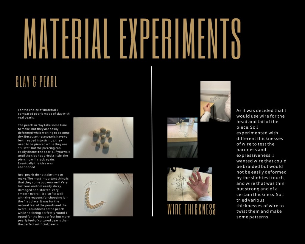
Pearl- One think can find in mussel, it is a classic and glossy decorations. People can use pearl to make jewelry.
Research outline:
I’m going to research the artist and I’m currently going to split it into primary research and secondary research. In subdivision into spiritual and formal. For example, I think I will research structuralism, because it inspired me spiritually. At the same time I think I should research jewellery designers, which inspires me in terms of form.
Summary:

word bank:
Structure- It is a construction built of various things, usually dramatising a certain sense of visual space. Sometimes it also represents the invisible structure of rules.
Research of structure of:
Structure can also be a framework from a spiritual point of view, and an articulation of relationships. It is also an interlocking relationship. Objects in a structure often have a relative and a unifying aspect. Structure does not represent stability, only relationship.
word bank:
Space- Space is a relative form of existence. The relationship of flow usually occurs when things are not one. It is because of the existence of space that this variable flow is present.
I started investigating an important branch of the structure, the space, and it was fascinating to see how this ever-changing presence was. Compared to structure space is a more ethereal concept. It is precisely because it is difficult to grasp that I wanted to record and express it with my own eyes and senses.
Note:
We discussed in detail what needs to be done in a composition and also learned how to introduce an artist in detail through a video.
Now I have a clear idea and plan of what I need to do for the session.
word bank:
Universe- It is the sum of all space and time, the most immense being that cannot be observed in its entirety. This space contains all the matter above and below, left and right, and all the time before and after. At the same time the universe is made up of relations and relationships. It is space composed of space in its immensity.
Summary:
Essay outline:
About Sarah Sze Outline
Introduction
Installation artist
Specialises in building atmospheric structures from everyday objects
Deconstructing everyday life and using it to reconstruct her understanding of it
It is not only her ideas that are fascinating. In terms of form she has a keen grasp of structure.
Style: Modernism
Materials: things from life
Sense of space: expression of people and society, people and people, ideas and social change.
Ideas: expression of one’s own understanding of society and life.
Little outline:
In this session we discussed the relevance of our dissertation to our own final work. I wanted to show the relational nature of people and social institutions in my work. I wanted to use the image of the snake to show this variability. I therefore studied Sarah Sze, an artist who specialises in showing spatial change and constantly exploring herself through her work.
After that I went to work on how to improve my WordPress and a big thank you to Syed here for his help on WordPress. Although in the end the improvements were still considered not convenient enough. But it is the best I could get so far.
I see space as a being that interprets relationships, and the most significant relationship in my life in my eyes is between people and social institutions. They are mutually necessary, mutually constraining and constantly changing. This fluidity is what I like and want to express.
Influenced by structuralism, I want my work to be resonant and thought provoking.
word bank:
Rules- generally constraints set by the group together. The cause is generally for the benefit of many or some people, and the emergence of social stability.
In the relationship of rules, it is more than lenient and normal operation. The relationship of tightening is always more clearly existential.
word bank:
Stranglehold – A word to describe an action, indicating that people are bound and strangled. Generally used in descriptions of hanging and snake attacks.
In this class I uploaded the final version of my essay. Afterwards I had a work related assignment with the group because afterwards we had to work on the PPT.
Essay:Introduce a artist
PPT:
Choice of materials: Pearls & Metals
There are a number of main reasons why I chose pearls.
Symbolically, pearls sometimes symbolise water. And as water is fluid, this versatility fits well with the multilateral relationship I wanted to express in my final work.
Also the pearl comes about because a grain of sand or whatever falls into the shell and the shell wraps itself in secretions in order for the sand to make itself uncomfortable. This is how the pearl is formed. This kind of object that comes into existence later because of a need is like a rule for me. Because there is a need, humans have created rules. Along with time the rules also want to try the pearl in the back shell gradually with yo a clear outline.
Not only is shape important, but I think the circle is the most magical shape of all. It represents infinity, transformation, reincarnation, circulation and so on. It’s like the rules of society are constantly changing and cyclical. Not only the needs of man, but also the laws of nature. But there are many round materials, and the pearl was chosen because of its natural imperfection. The world is not perfect, and therefore neither are people nor rules perfect. Otherwise relationships would not change, they would not feel loose at times and too constricting at others. The natural imperfection of pearls therefore perfectly matches the material I have in mind for my work.
My choice of metal was influenced by the Bauhaus and structuralism. I thought that visually, combining industrial and classical materials would lead to a new visual experience. At the same time I am not worried about the harmony of the two materials, as both have a nice glossy look, so I think the whole will be in harmony.
Also, I don’t want my work to be too busy as a whole. I wanted to be more simple and powerful in parts. I would like to replace some parts with abstraction and agency rather than all detail. This is why I chose metal. Because metal can easily show simple structures with clear lines.
Research:
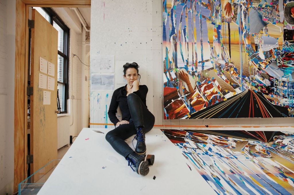
Sarah Sze
The installation artist’s work is also like her words, as she has always cleverly linked time and society with various materials in life. Her understanding of society and social relations is presented in a spatial structure. Installations, acrylics, paintings, drawings, and even videos are used to present her work. Just like his installations, she is free and versatile. There is a casual yet structured and delicate beauty.
11 rooms in Materials and Objects
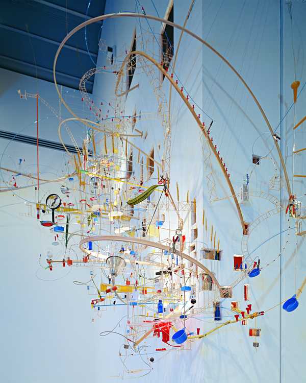
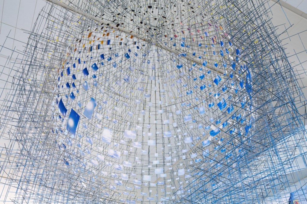
11 rooms in Materials and Objects, for example, uses a wide range of materials and colours in this work. However, the other details are tied together by a few existential curves, making it easy to see that the installation has a spiral structure while retaining the complex structure. Her work is modern, using her interpretation to navigate this overload of information in an age of information overload. As documented by Hidden Relief. Her installations are like a series of experiments that construct intimate systems of order – unstable ecologies in which the materials convey meaning and a sense of loss. ‘
Night today
The almost metallic sphere of “Night today”, for example, is driven by an exploding line of wooden structures reminiscent of the Big Bang. Destruction, creation, kinetic time, and many other words close to the roots of the world. It is like an exploration of the beginning and end of the world, and like an eternal question to the viewer. She is good at making sharp, clear work out of hard stuff. Of course, she is also very good at making complex and ornate works from more soft or not quite firm and not quite soft enough wire.

In ‘Shorter than the Day’, she uses several photographs of the sky. Many of them have the sun or sunlight in them. Sarah Sze is flexible in her choice of materials, which makes her work even more attractive. This work looks like a huge sky. The structure of the metal bars and the photographs of the sky at different times of the day give a visual impression. However, if the distance is increased and the perspective is changed, the result is much different. If one is far enough away, the structure becomes a suspended spherical object, like the earth. The blue sky photo looks like the part of the ocean in the Earth at a distance. Likewise if you get very close, each photograph is still a kind of time period of the sky. If someone, as a viewer, were to look upwards from far to near as the structure rises, they would feel the time of day draining away at the speed of light. The changing structure interprets the work in different ways.
This variation in structure inspired me very much to discover that structure is not a fixed monolithic thing. It is something that can become a flexible and variable being through various means.

Reference:
About [www Document], n.d. . MIZUKI. URL https://mizukijewels.com/pages/about (accessed 2.23.23).
AnOther, 2023. Polina Osipova, the Artist and Designer Celebrating Her Chuvash Roots Iwww Document] . AnOther.
URI https://www.anothermag.com/fashion-beauty/14644/polina-osipova-chuvash-roots-gucci-florence-welch
(accessed 2.23.23).
Dazed, 2021. Polina Osipova is forging armour for the Chuvash warrior women of her past [www DocumentJ. Dazed.
URL https:/ /www.dazeddigital.com/art-photography/article/54629/1/polina-osipova-russian-artist-chuvash-gucci-
russia-traditional-folklore-craft (accessed 2.23.23).
Nast, C., 2022. Polina Osipova Is Putting Chuvash Culture On the Map In Russia-and Beyond [www Document].
Vogue. URL https://www.vogue.com/ article/polina-osipova-is-putting-chuvash-culture-on-the-map-in-russia-and-
beyond (accessed 2.23.23).
Nast, C., 2018.5 jewelry designers reinventing pearls Iwww DocumentJ. Vogue France. URL
https://www.vogue.fr/jewelry/profile/ story/5-jewellery-designers-reinventing-pearls/1779 (accessed 2.23.23).
Nast, C., 2022. Polina Osipova Is Putting Chuvash Culture On the Map In Russia-and Beyond [www Document].
Vogue. URL https://www.vogue.com/ article/polina-osipova-is-putting-chuvash-culture-on-the-map-in-russia-and-
beyond (accessed 2.23.23).
What Do Pearls Symbolize? The Meaning and History of Pearls Iwww Document], n.d. . Sterling Forever. URL
https:/ /www.sterlingforever.com/blogs/blog/what-do-pearls-symbolize-the-meaning-and-history-of-pearls
accessed 2.23.23).
Mizuki Goltz
Mizuki Goltz is a famous artist and designer. She knows pearls very well and especially knows how to match them. In her work, the pearls show fluidity and harmony. According to the words of Vogue ‘Goltz is known for her unusual pairings. (Pearls and leather, she’s discovered, make excellent bedfellows)’

In terms of choice of material this is a very classic choice, teardrop pearls and round pearls are the most popular shapes in traditional and classical styles. (Amber pearls 2022) Metal or leather as a secondary material is also a classic accompaniment to the beauty of pearls. Mikimoto, as well as a large number of mainstream jewellery brands, tend to use metal as an accessory alongside pearls. Based on an observation of the pictures of the pieces on the official website.
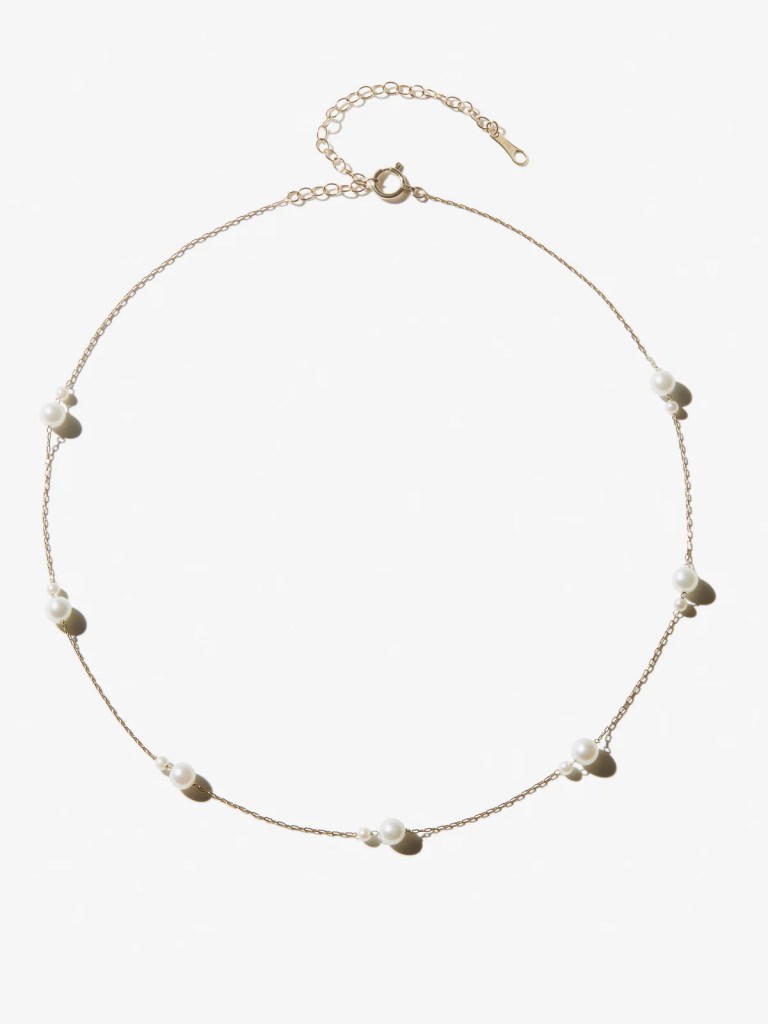
Mizuki Goltz, focuses more on the pearls themselves. Both the material and the process are designed to make the pearls more beautiful. (MIZUKI. URL. 2022)Most of her well-known pieces and the presentations on her official website emphasize the beauty of the pearl’s lines. Examples include the Kissing Double Akoya Pearl Necklace SBN242, and the Sea of Beauty Collection. Floating Pearl Chain Necklace SBN149 and many more.
Reference:
About [www Document], n.d. . MIZUKI. URL https://mizukijewels.com/pages/about (accessed 2.23.23).
Nast, C., 2018.5 jewelry designers reinventing pearls Iwww DocumentJ. Vogue France. URL
https://www.vogue.fr/jewelry/profile/ story/5-jewellery-designers-reinventing-pearls/1779 (accessed 2.23.23).
What Do Pearls Symbolize? The Meaning and History of Pearls Iwww Document], n.d. . Sterling Forever. URL
https:/ /www.sterlingforever.com/blogs/blog/what-do-pearls-symbolize-the-meaning-and-history-of-pearls
accessed 2.23.23).
Polina Osipova
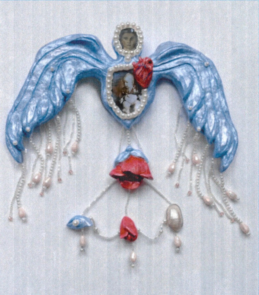
Polina Osipova, who is more of an avant-garde artist, has instead incorporated several ethnic features. She often creates mysteriously large decorative objects. The eye is a common source for her creations. The pearl is often used as a border for the eye and as a mass of tears dangling from beneath it. Just in 2022, Vogue described her work this way ‘she wears a headdress shaped like a large thimble that is beaded and covered in metal coins. These pieces reference Osipova’s Chuvash roots, an ancient Turkic ethnicity that lives within Russia’s borders and parts of Estonia.’

The web version of Vogue features her work with lace and old photographs and pearls. She was also featured in Another with a headpiece made from pearls and a lace border. Based on observations. This innovative choice of materials is all in the service of her ideas.There are many differences between the two artists’ works, but they both chose to use pearls as an important material. A pearl is very attractive, with its elegant luster and smooth lines.Susan V’s view is that ‘A pearl is often seen as a symbol of purity, innocence, and beauty. It is also associated with the moon and water.’ Some peoples feel that the pearl represents wisdom. Also pearls as gifts have many blessed meanings.(2022) The smooth, present form and the versatility of the symbolism are why Mizuki Goltz and Polina Osipova, who have very different styles, chose the same material.
Polina Osipova, is more concerned with expressing her ideas, emotions, and culture. This is why she uses pearls more as a way of expressing her thoughts and telling her story. Pearls are an important material and medium for her work. But sometimes they can also be used as secondary material, rather than always being the subject of the work.

Polina Osipova prefers to use the storytelling of pearls to represent memories and feelings. They use pearls and therefore their work starts with some aspect of pearls. Not only are the pearls used allegorically, but the meaning of the pearls increases with their expression. This compatibility is one of the biggest reasons why the creators need pearls and are keen to use them in their creations.

Reference:
AnOther, 2023. Polina Osipova, the Artist and Designer Celebrating Her Chuvash Roots Iwww Document] . AnOther.
URI https://www.anothermag.com/fashion-beauty/14644/polina-osipova-chuvash-roots-gucci-florence-welch
(accessed 2.23.23).
Dazed, 2021. Polina Osipova is forging armour for the Chuvash warrior women of her past [www DocumentJ. Dazed.
URL https:/ /www.dazeddigital.com/art-photography/article/54629/1/polina-osipova-russian-artist-chuvash-gucci-
russia-traditional-folklore-craft (accessed 2.23.23).
Nast, C., 2022. Polina Osipova Is Putting Chuvash Culture On the Map In Russia-and Beyond [www Document].
Vogue. URL https://www.vogue.com/ article/polina-osipova-is-putting-chuvash-culture-on-the-map-in-russia-and-
beyond (accessed 2.23.23).
Paul Rand
Paul Rand is a renowned American designer. He specialises in designing graphic artwork, logos and more. He is known as the Picasso of graphic design. His style is a very avant-garde kind of deconstructionism.
He is famous for his reluctance to have the details of his work altered. It is also for this reason that his work is very fine. It looks simple, but in reality it is not very simple in terms of either the colours used or the structure. And it is because of Paul Rand’s unwillingness to budge on his work. This is what makes his work so simple and beautiful, yet so full of detail.
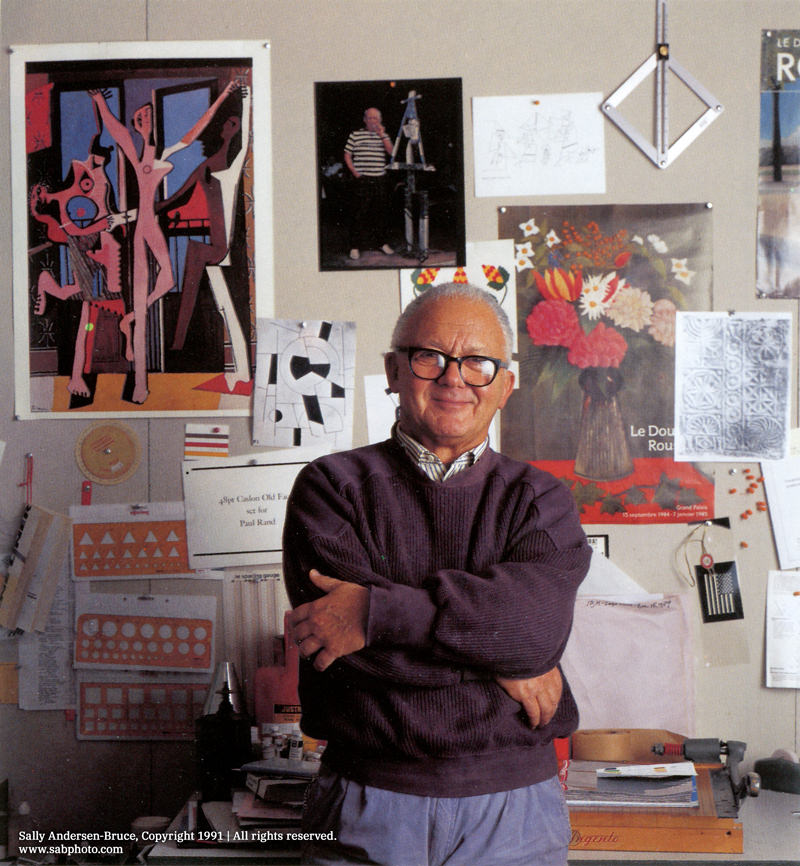
NEXT
He is also very professional, for example with his NEXT, which is a poster with the letters NEXT, but NEXT is used too often in posters. So Paul Rand experiments with different fonts and sizes in order to create his own perfect NEXT.
I think it is very important to have such a serious and professional graphic designer. Because graphic design is, literally, flat. It is a very simple vehicle, so the slightest imperfection will be very obvious. That’s why I think people like Paul Rand are natural graphic designers.
‘Rand’s work was regularly featured in the daily lives of Americans in advertising posters and logos for consumption brands, from alcohol to make-up.’
I think his designs have inspired me in my choices. Because it’s actual in not monotonous usually with more than 2g poles of colourways. But he is very well divided in his structure so that even if more colours are used it still looks clear because of the division of the knotty lines.

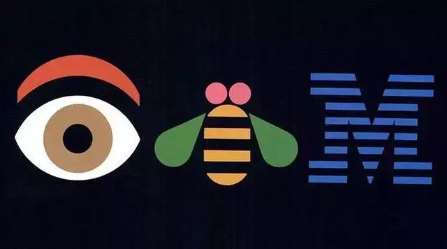
eye-bee-M
This is a work in which pictures are used as symbols to represent words or pronunciations. It is simple and straightforward in its reference and when one pronounces it this kind of fun makes one smile. It is very stylised and memorable.
His posters are made up of simple geometric compositions, but the things expressed are very precise. It is a work that anyone can appreciate.
There is a clear edge to his work. The different colours do not jump out of the box. In addition, the colours he uses are all of the same brightness.
In addition, the colours are all of the same brightness, so the image itself is very harmonious.
I think he has inspired me in terms of the colour scheme, rather than being stuck in a few simple colours of black, white and grey, I think it is better to be free with the colours. His work shows me that even if you use more than one colour as long as you study the colours well enough you will not get confused.
Reference:
Confusion and Chaos: The Seduction of Contemporary Graphic Design Paul Rand: Modernist Master 1914-1996 [WWW
Document], n.. URL https://www.paulrand.design/writing/articles/1992-confusion-and-chaos-the-seduction-of-
contemporary-graphic-design. html (accessed 3.27.23).
Bauhaus
Bauhaus, this is an obvious style, Usually, the style of Bauhaus is a mix of industry and design. Designers think the simple is complexity.
They use art with craft and mass production
Form follow function, which means the form is always more important than the aesthetic appeal of the design.
They are honest about materials as the Bauhaus teacher said. ” materials should reflect the true nature of objects and buildings.”
I was influenced by it in terms of the materials I wanted, and in addition to the traditional pearl of the main material I opted for a harder angular metal. This is a more industrial choice that looks at practicality.

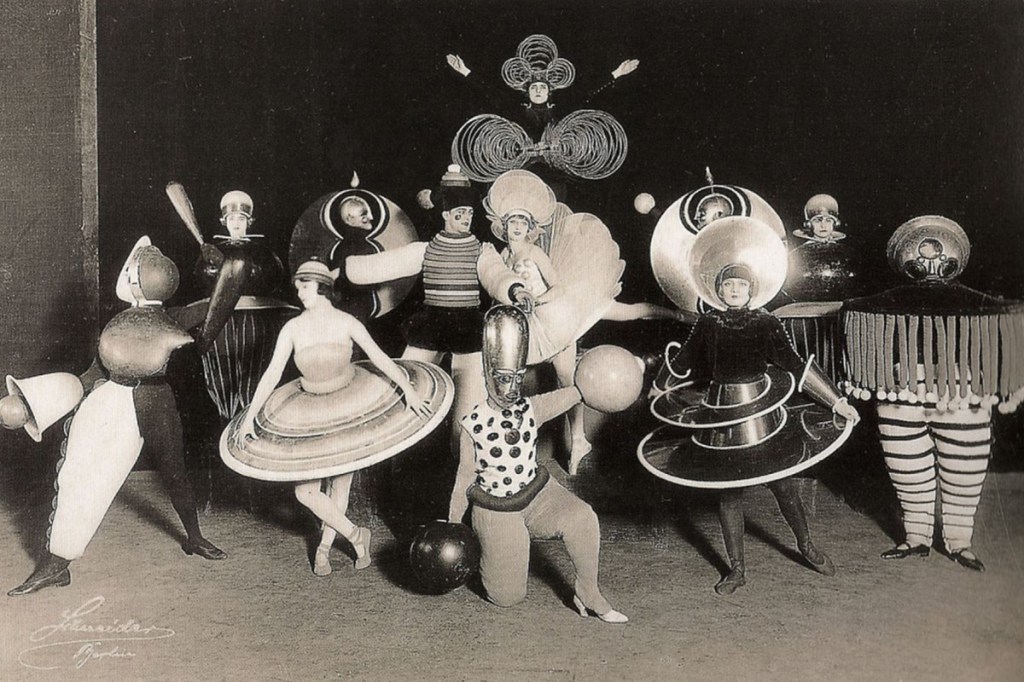
Oskar Schlemmer

Oskar Schlemmer taught at the school from 1920 to 1929, specializing in design, sculpture and murals, but preferring to pursue theater. That why his most famous work is about theater. The Triadic Ballet, Schlemmer transformed his dancers in kinetic sculptures by costuming them in geometric shapes made from metal, cardboard and wood.
I was very general about his paintings, but when I saw his stage work I felt I had to speak about him. oskar made progress in my stagnant creativity. I think he is the one who stands out in this pioneering style of Bauhaus. Because he also incorporates a very classical harmony into the ballet. But this fusion of geometry and classicality is what makes Bauhus so free at its core. It is very attractive and fascinating, and my first work will be inspired by his form.
This is why I wanted to try traditional pearls and unconventional angular metal spiral constructions. Because I realised after seeing his work that this combination could lead to a new kind of harmonious piece.
Reference:
Britannica [WWW Document], n.d. URL https://www.britannica.com/topic/Bauhau (accessed 3.27.23).
The characteristics of Bauhaus [WWW Document], n.d. . Catawiki. URL https://www.catawiki.com/en/stories/5263-5-
characteristics-of-bauhaus-art-architecture-and-design(accessed 3.27.23).
saymedia.com [WWW Document], n.d. URL https://www.history.com/topics/art-history/bauhaus#section_5 (accessed
3.27.23).
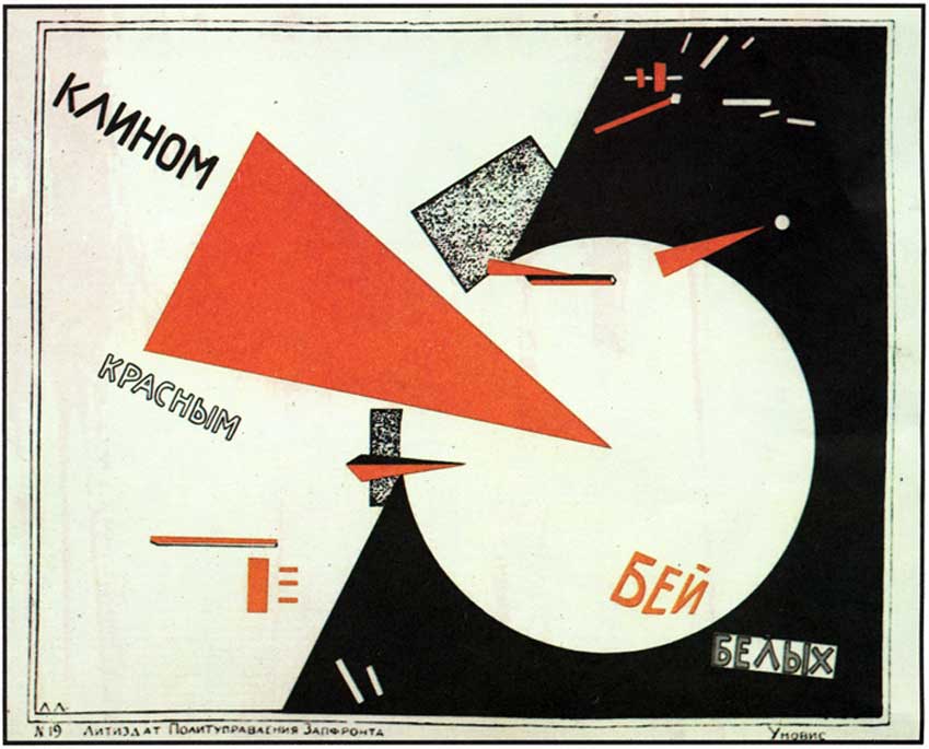
Constructivism
Structuralism was a pioneering art that became popular in the Soviet Union in the early twentieth century.
Structuralism differs from the various Classicalisms that were popular in the past in that they do not serve a designated person or class of people. Rather, they served the masses and sought to awaken the spirit of the people. To guide the minds of the people.
Works that serve the masses must be of a practical and communal nature. The identity of the artist has therefore changed. According to Magazine artland ‘In Constructivism, the role of the artist was re-imagined – the artist became an engineer wielding tools, instead of a painter holding a brush.”
Under the idea of Constructivism, art existed to help people communicate ideas. It was more like a tool or a medium.
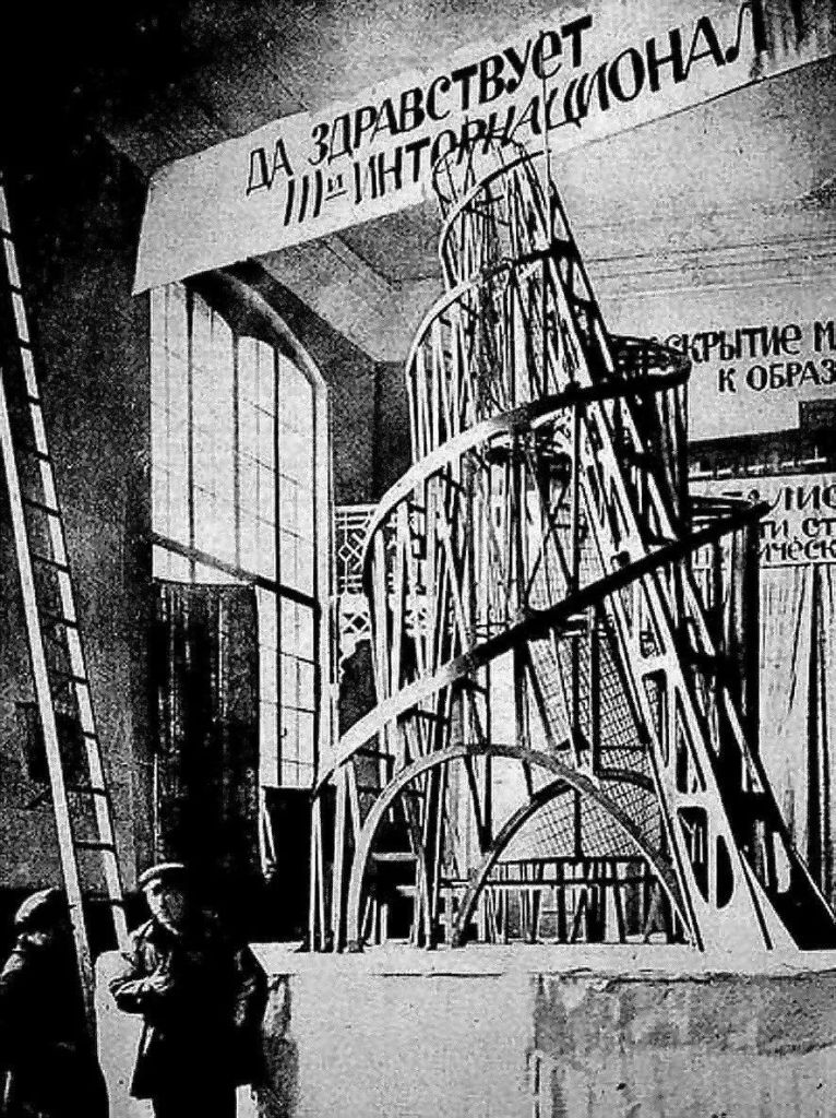
Vladimir Tatlin
Vladimir Tatlin, in full Vladimir Yevgrafovich Tatlin, (born December 16 [December 28, New Style], 1885, Kharkov, Russian Empire [now in Ukraine]—died May 31, 1953, Moscow, Russia, U.S.S.R.), Ukrainian painter, sculptor, and architect remembered for his visionary “Monument to the Third International” in Moscow, 1920.
Monument to the Third International
Vladimir Tatlin’s Monument to the Third International is a tall spiral tower made of glass and iron. It represents structuralism and the spiritual aspirations of the Soviets of the era.
The work is a multidisciplinary mix of painting, architecture and sculpture. It represents a modern spirit and a revolutionary ethos.
I am spiritually influenced by this style in a major way and I did not make my final piece just to make a fine necklace. What I wanted to really do was to convey my thoughts, I was hoping that my work would cause people to think about the relationship between people and society and rules.
Simeon Shomov
Narrative silver jewellery
This is a Bulgarian jewellery artist. He uses silver and a small amount of gold to produce a structured work of art with clear contours.
This work illustrates a story and also illustrates different spaces through the staggering of the results. But with the influence of structuralism, it is not a mere work of art. It is a piece of jewellery that can be worn and used.

Reference:
A small, simple and smart family hallway [WWW Document], n.d. URL
https://www.ikea.com/gb/en/rooms/hallway/how-to/a-minimalist-family-hallway-pub3e1c27co (accessed
3.24.23).
Simeon Shomov “Labyrinth‘, ring – ilver 925’, 24k gold plated, 700 degrees glass enamel [WWW Document], n.d. URL https://putti.lv/simeon-shomov-labyrinth-ring-ilver-925%2%80%b2-24k-gold-plated-7oo-degrees-glass-enamel/(accessed 3.24.23).
Painting | History, Artists, Elements, Techniques, Types, & Facts | Britannica [WWW Document], n.d. URL
https://www.britannica.com/art/painting (accessed 3.24.23).
Tate, n.d. Constructivism [WWW Document]. Tate. URL https://www.tate.org.uk/art/art-terms/c/constructivism (accessed 3.24.23).
Williamson, B., n.d. Sarah Sze [WWW Document]. URL https: //www.studiointernational.com/index.php/sarah-sze-exhibition-review-victoria-miro-london (accessed 2.24.23).
Klaus Rinke
Instead of the more mainstream painting of that era, Klaus Rinke painted sculpture, opting instead for the more self-relevant body itself. “In the early 1960s, he abandoned two- and three-dimensional mediums in favor of body art. He chose “the gesture of the body as a dematerialized and most intelligible medium,””

Rinke’s work has elements of water and always, as a symbolic device. To symbolise the notion of flowing continuity and impermanence. ta3 sees water as a symbol of the feminine, and the feminine as the root of humanity. Thus when he interferes with time with water it is a manifestation of interfering with objective laws with human existence. He uses the elements to represent a concept, and the interaction of the elements with each other to represent relationships and changes in space. This has inspired me and it is because of his work that I have to think about the deeper meaning behind an image.

Reference:
https://www.tate.org.uk/art/artists/klaus-rinke-1846
Tate, n.d. Klaus Rinke born 1939 [WWW Document]. Tate. URL https: //www.tate.org.uk/art/artists/klaus-rinke-1846
(accessed 3.27.23).
Primary research
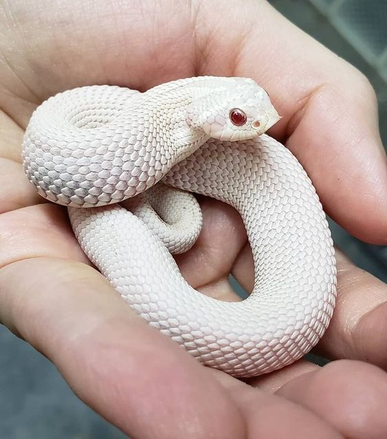
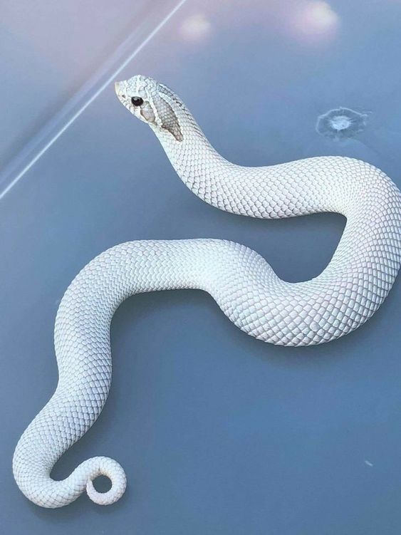
Snake
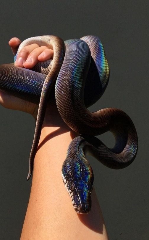
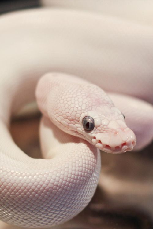
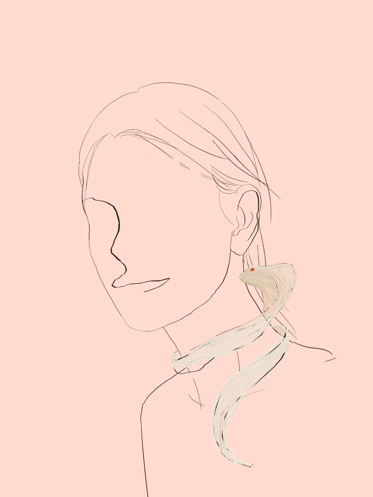
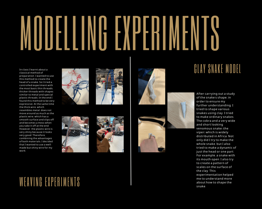
I searched for images of snakes in order to determine which type of snake I would like to favour for the final working snake. These were also the models that I would use for my sketches. Although the necklace was originally inspired by and named after the blue-eyed Lucy strain of the ball python, the ball python is a bit more bulky. However, the ball pythons are rather bulky in shape. The decision to use the Colubridae was made through observation. This snake does not have a clear symbolism, unlike the cobras, and its long, slender body and even proportions are more in keeping with the image of the snake and the pearl chain.


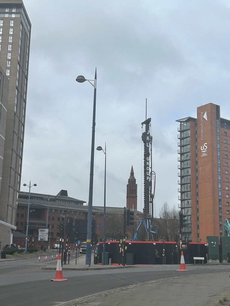
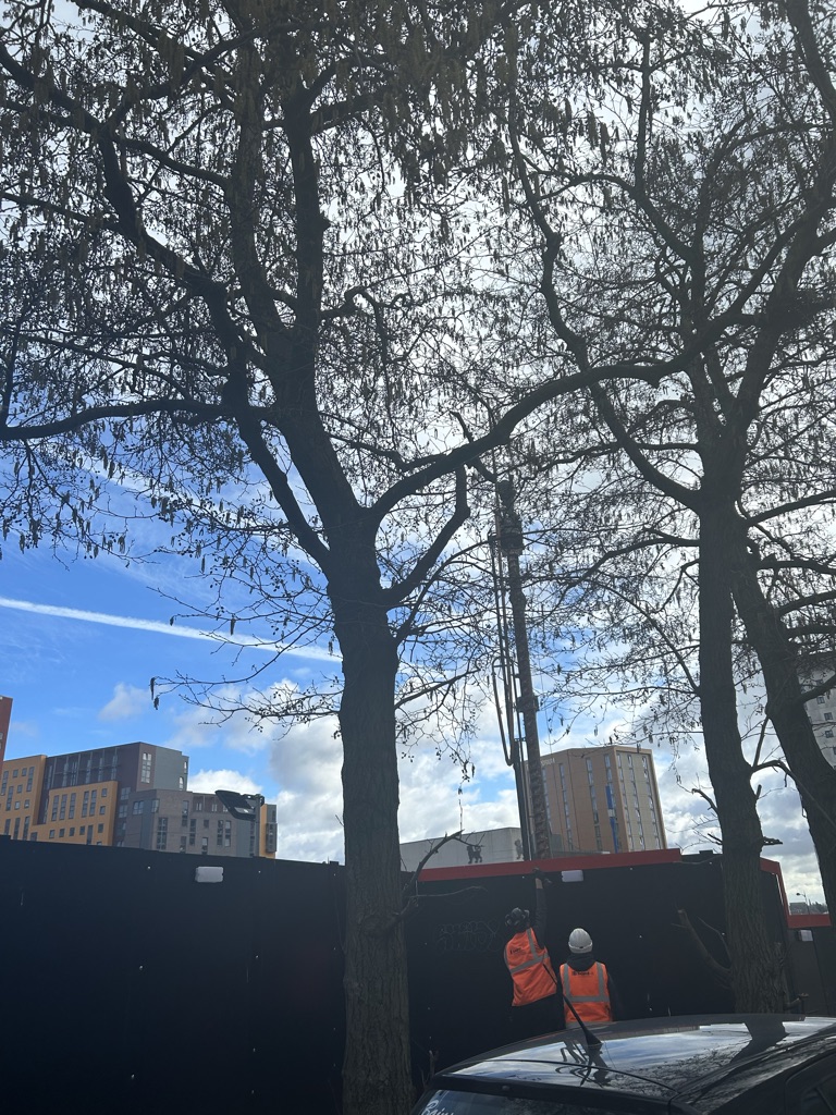
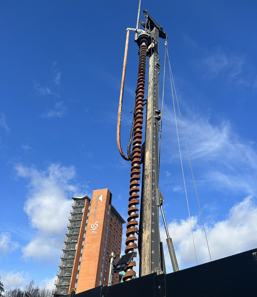
Auger driller
When I first saw the Auger driller I couldn’t take my eyes off it. It was a very tall spiral device, constantly spinning and destroying the original mechanism of the land. It was a very powerful and existential installation. I had wanted to combine something classical and modern. And I was inspired by this kind of device with its power and industrial dryness. Because the spiral is like a superposition of forces, it gives a sense of flowing power. That’s why it can destroy the land. This feeling of power and flow appealed to me.

Poster in Tesco
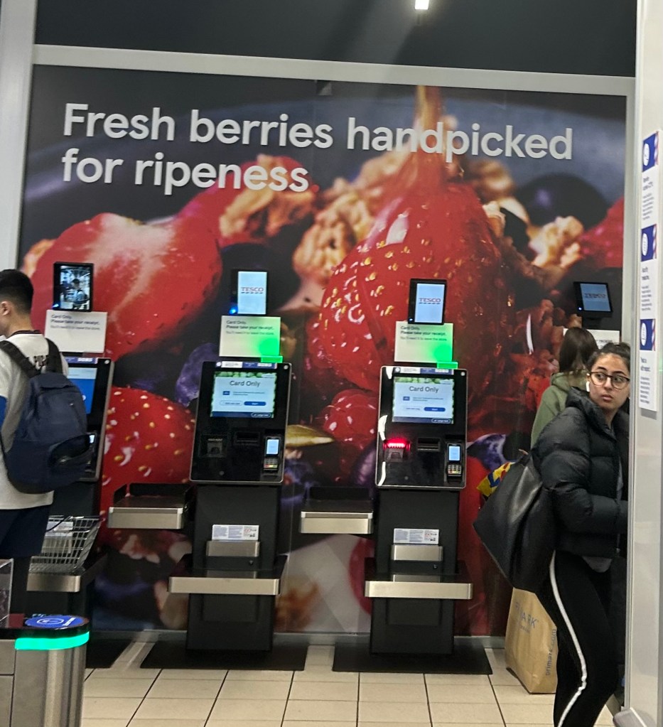
This is a poster for Tesco. It is in a very important location, the checkout location. Anyone going to the checkout or looking towards the checkout location will see it.
It is set against a blue tinted grey and black background, which contrasts with the vibrant colours of the strawberries in the main image. Also on the background is bold white text used for eye-catching purposes. It is a very simple sentence. “Fresh berries handpicked for ripeness.” I think this phrase shows both the excellence of the goods in the supermarket with Fresh. It also shows the heart and sincerity of the supermarket to its customers from handpicked, as human resources are relatively expensive.
The main colour of this poster is red strawberries, and red is generally exciting to see. Bright red, on the other hand, gives an appetising and life-affirming feeling. It will look striking because of the base colour. Such excitement will create a certain desire to buy. If the person is not buying fruit perhaps people will go and buy it before they go to the checkout. This is what promotes consumption.
I think the poster is very simple, broken down it is just a photo and a quote. But both the text, the placement and colour and the composition are very useful. I think this poster is excellent because it has the impact that the supermarket wants.
This inspired me to think that it would be better to use just one or two materials than to use many. And it’s important to prioritise so that the character of your work may be better highlighte
About international women day.
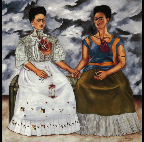
The women power icon- Frida Kahlo
She’s works often have a sense of defiance. Her paintings are always full of defiance, ego, anger, and a vibrant atmosphere.
Mexican artist Frida Kahlo is remembered for her self-portraits, pain and passion, and bold, vibrant colors.(https://www.fridakahlo.org/)
Draft:
I have created 20 drafts of snake related jewellery belts etc. As well as structure-related jewellery objects, and drawings. Finally, I also made a few drawings to record my own thoughts and feelings and my state of life.
All these things have their roots in Identification – structure, and it goes without saying that the structure-related jewellery paintings are a very direct link. The snake related ones are derived from the final work on the changing space and the changing objects such as snakes and prey. And finally about the structure and documentation of life, these are the first few that I started with when I was working on the 20 drafts. I believe that everything is inspired by life, so I wanted to write down the feelings I encountered in my life first. This will then lead to the most straightforward structure-related pieces, and the more developed snake-related decorations.
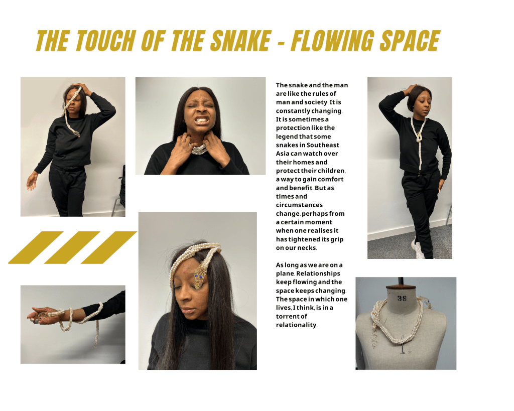
About snake:

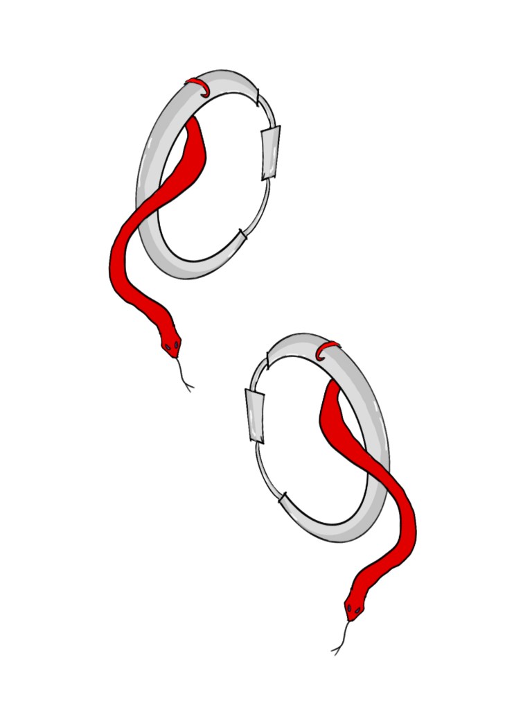
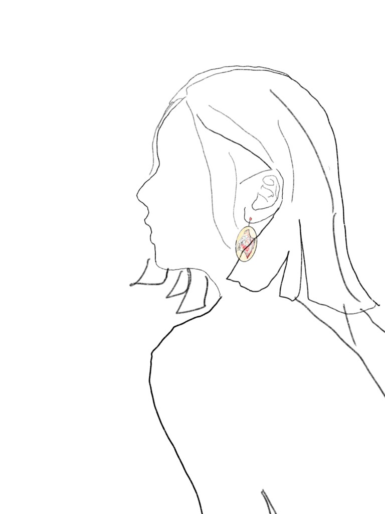

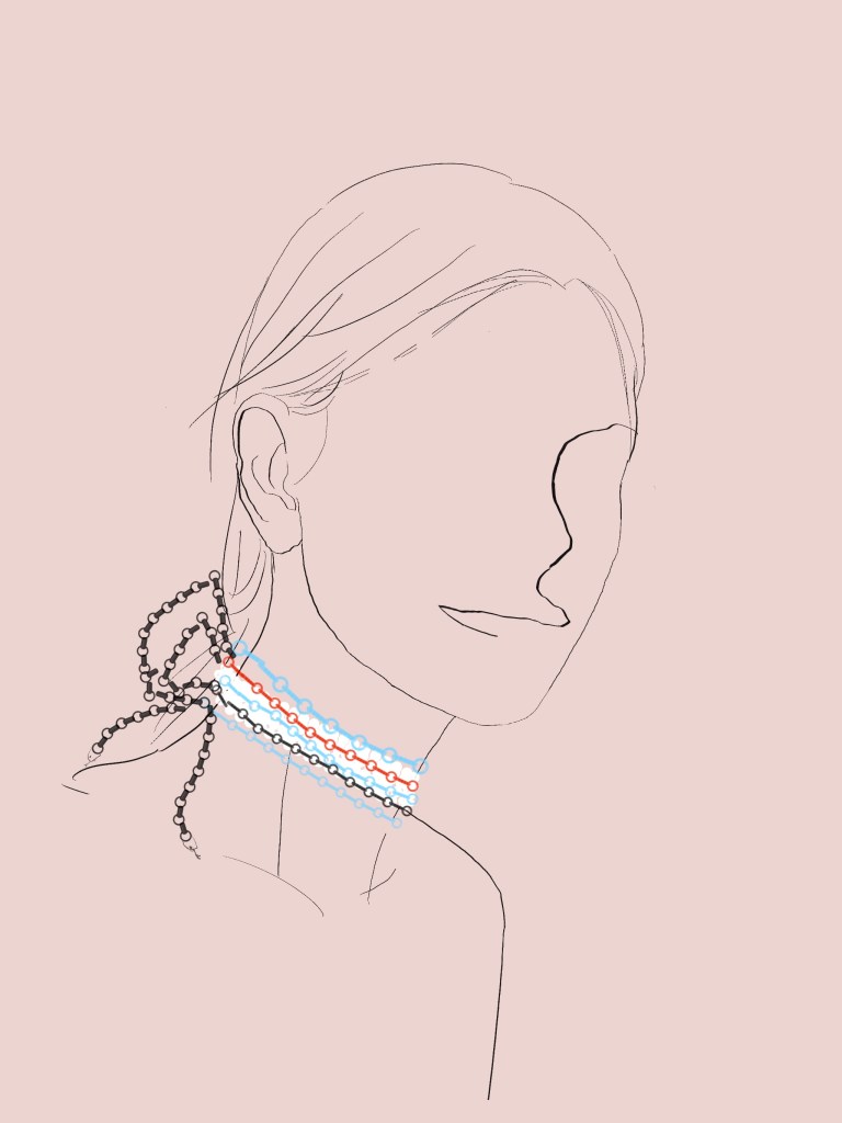
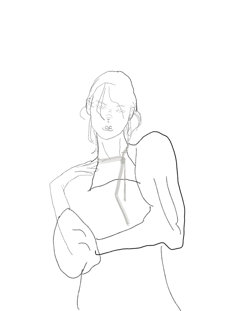
- This pearl snake necklace is strung entirely with pearls and embellished with two rubies. To give the snake more dimension, the thread used to string the pearls is of a harder but less permanent crease material. The main source of inspiration for this connection is the cobra, a reference to the way the cobra stands up on part of the Egyptian crown. While people generally like to use gold and silver for snakes, I wanted to experiment with pearls, an uncommon pairing. I thought this blend might be a classically expressive piece.
- This is a double ponytail hairband made of metal. The double ponytail is something that is very important to me as a symbol of my desire to follow my heart. I used to have them when I was a child, but my father said they didn’t fit and didn’t look good. I think he was just saying that, but I really never used it again. It wasn’t until I became more self-conscious around the age of 18 that I wore it again. It was only after trying it that I realised it was just a haircut, but it was more fun to do it because I wanted to do it than anything else. Afterwards I realised that this kind of haircut seems to have been worn by very young and cute people, usually with cute bows and ribbons and lace. So I wanted to create something other than a cute hairpiece. I thought that snakes and metal might be a good match. That was the reason for creating this piece. I also chose red because it has a sense of power and life, and it is also a more powerful and present colour than green.
- The necklace with the snake’s egg is still inspired by snakes. I think the birth of a snake is also well worth recording. The birth of anything is very life-affirming. Especially the snake, whose egg is ivory-white and slightly longer than an egg and looks very clean. At the same time there is this blood-tinged mucous membrane inside, which gives a real sense of being alive. Snakes are variable and you never know what they are going to look like until they actually break their shells. I therefore see it as a symbol of vitality, which I wanted to document in the form of jewellery. In terms of the illusion of a visual-auditory connection, it seemed more interesting to have the sound of life breaking apart as an earring, as if it could be heard, rather than a necklace, for example. So in the end I chose the earrings.
- The Tree Viper Snake Bracelet is a bracelet I wanted to make from cardboard, inspired by Japanese origami. This layered look is very fine. The colour of the paper can be as bright and beautiful as the tree viper’s outwardly curved scales. It even has a childlike and light feel to it. It is the most different part of the piece that I have tried compared to the previous ones.
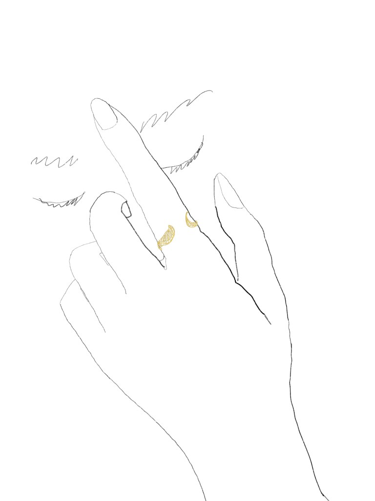
- Gold wire woven pig-nosed snake ring, my draft of this design is a ring woven with gold wire. This craft can be seen in Chinese European Turkish jewellery and furniture. I think it is very present and expressive, but has a lighter and less heavy expression. It suits the pig-nosed snake, which is a relatively small type of snake among snakes and has a very cute face. Also the golden weave is a similar design to the head of the snake I envisage in my final work. So I drew it out as an experiment to make sure the final design was suitable for this kind of expression.
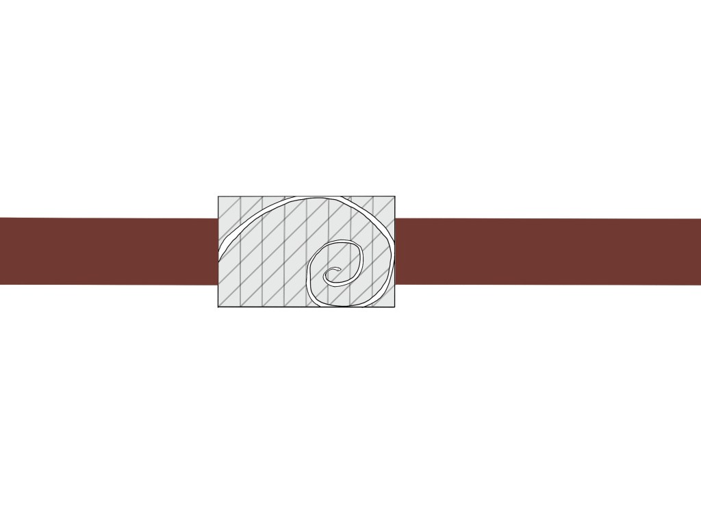
- The belt of the snake, which draws on the golden ratio. It is engraved in sterling silver. This piece was the last of the snake related pieces. The intention was almost entirely to express the graceful curves and flexibility of the snake. It was therefore decided to make the snake coiled in the golden ratio. The simplicity of the material also helps to make the pattern of the belt a real point of interest.


- When it comes to things related to structures one thinks of churches, and this painting is inspired by church windows. Like the shapes of the mountains and the sun, the simple black and white is reflected in the windows. The irregular geometric shapes are at once like the landscape outside the window, like the window flowers on it, and like the broken glass itself. I find it fascinating that the structure allows for endless speculation. And this work is about capturing that conjecture in a partly figurative matter.
- Baboon’s Face, which is a geometric drawing of my baboon’s face. The difference between the realistic style of the drawing and that of the baboon may not be immediately apparent. But I did exaggerate to the maximum and show my perception of a baboon. The huge head and the forward leaning jaws. 3.
- Geometric collage bag, inspired by Picasso’s violin collages. I think geometric shapes and collage are expressive. So I wanted to try to make a handbag in this form. In fact it’s more like a poster for a handbag. I wanted to represent a state of irrational heterogeneity in which different structures are put together. 4.
- For the structured necklace, I would like to make it out of clear glass or acrylic. Maybe just glass from a wine bottle. The structure is a state of superimposition. The superimposed combination of one’s own lines and the lines of the human body into a new visual experience. It is created to change a structure. I think I could also try experimenting with changing the material to concave lenses etc. afterwards.
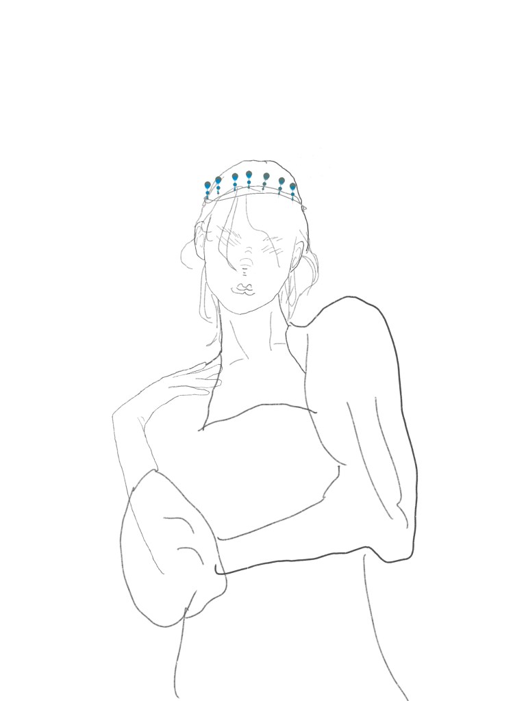
- Downward Drop Crown, which is a drop-like crown. I wanted to show the danger of right. Beautiful and dangerous. A heavy right and the very few people who bear it, so that it appears fragile. But a right that is separate is not a right. I wanted to show my understanding of rights with this fragile structure.
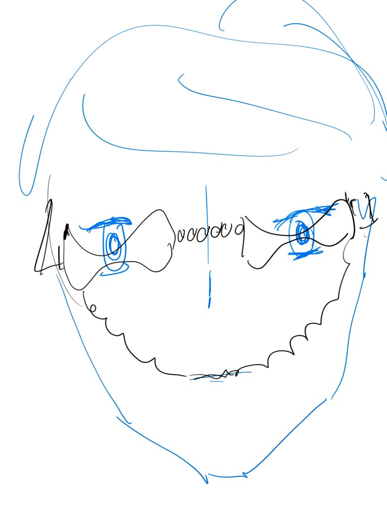
- presbyopia, which is my visual fantasy of growing old. I don’t think getting old is scary because there is no dead old age is the way to go. It’s just interesting, unlike nearsightedness where you can’t see things up close when you’re old. It’s like aging and becoming distorted. I wanted to use this distorted presbyopia to show my delusion about the process of growing old, especially how my eyes feel.
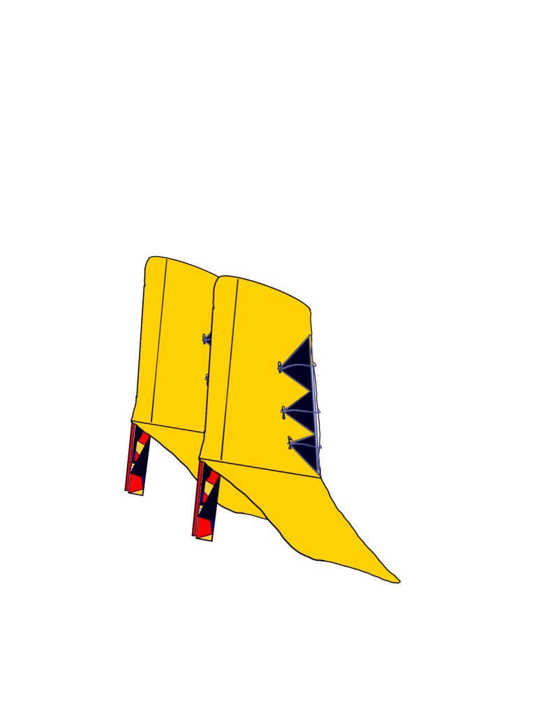
- The boots, the colour scheme is inspired by the common colour scheme found on Bauhausist posters. That is, yellow black red and white. I wanted to try and create a shoe in this colour which is full of structure. It was more like incorporating the Bauhaus style into this creation. At the same time it adds my own personal touch, which is a tight, irregular and irrational structure. One can feel it in the heel part of the shoe.
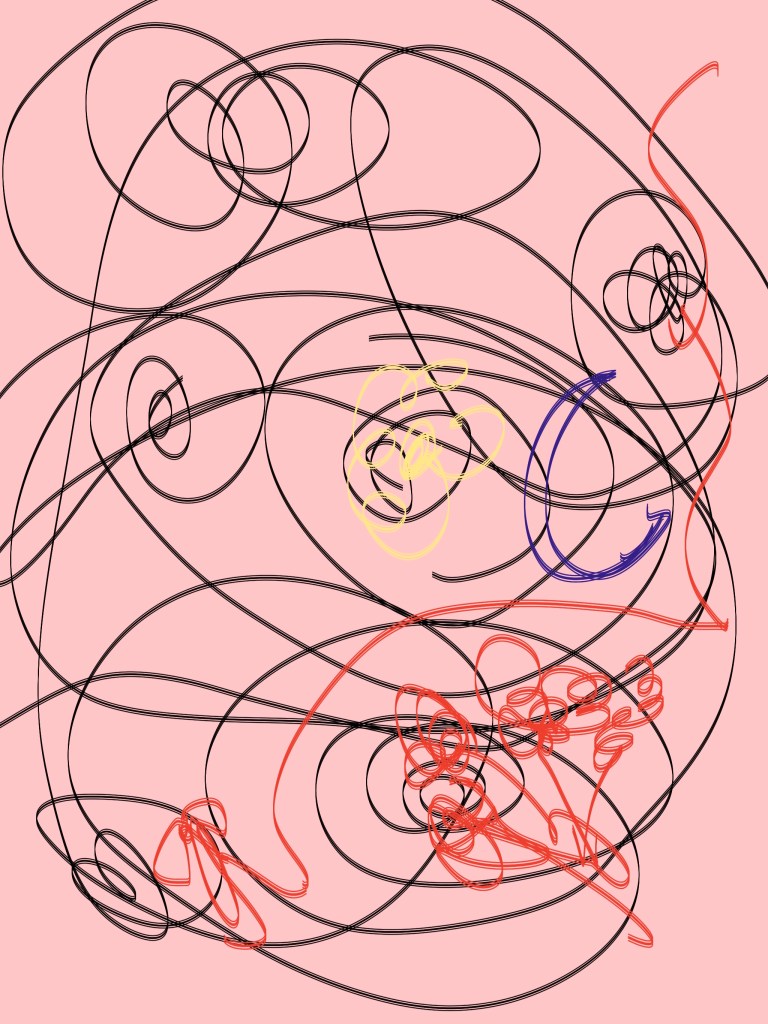
- Waking Dreams, which is my structural representation of what a waking dream looks like. I see dreams as a means for people’s subconscious to peer into themselves and the world. At the same time realistic feelings and fantasies are the triggers for dreams. So the dream is a piece by piece and incomplete. At the same time it is very confusing and yet seems to have doors and windows. It seems to lead to something unknown. At the same time the dream is coming to an end when one realises that one has really seen the irrationality of the dream. I then wanted to show this moment of feeling. This structure and consciousness that is about to shatter.
- An old photo installation, this is a white room. The room has a number of movable mechanisms. The mechanisms have small grey and white balls of different colours. People who pass through this room are sure to leave their mark. When they leave the room they will have a look. The change of the little balls is the trajectory of people’s movements. I think it’s like an old photograph, a fine pixelated record of the emotions and tendencies of things released in a moment. That’s where my inspiration comes from.


- a drowsy view, I wanted to convey that feeling. In the trance the world is gradually becoming darker. The lights reappear in front of the eyes from other angles. The rotation of space remains fairly intact, a sign that consciousness is still present. But the black lines before my eyes are again oppressive, making it too inconspicuous. This exhaustion is the emotion I wanted to record from the previous period.
- illness and me, which may be the new self-portrait may have taken inspiration from Frida’s self-portrait. I also wanted to try to draw myself in relation to my illness. My illness is neither curable nor life-threatening. It’s both mentally draining and not to the point where I can just rest in bed. It’s really interesting. Whenever this illness strikes I feel their life force like rolled up grass, wild flowers in full bloom. Like ribbons dotting my life, moving forward with time. And I would get the emotions I only get when I’m sick, uncertainty and confusion and stagnation.
- The glass is broken and this is the installation I want to make. This is my observed emotion and not my own. Some people’s emotions don’t come out all the time, they accumulate. Knowing that an outburst, like a broken glass is bound to destroy something. They seem to restrain themselves, but then they seem to be less than unknowable. At the end of the day it’s just tragedy and welling up of emotions.
- happy snail paradise, I see snails as a symbol of boundary breaking. Just a sprinkle of salt and they melt into water and don’t maintain their form. Whereas people and many things cannot do that, we all seem to be limited by something, or can only observe the world within this limitation. This is very safe and reasonable for the mind. But I think it must be fascinating that even the boundaries of existence can be blurred. This is exactly what I wanted to show.
- coral bunny. This is a rabbit with furry coral antlers. It was the first character I designed this semester. Coral bunnies are non-threatened creatures, but are rarely observed and no scientific classification has yet emerged. It has a beautiful head but runs fast on its feet and no one can see its lower half yet.
Two drafts will be developed down:


Develop 10:
Five wrap-around jewellery pieces developed from the pearl cobra necklace:
Original version:
5 structural device related dispersions:


This is the most satisfying of the snake ornament sections that I have selected from 20 drafts. After drawing this cobra pearl necklace I realised that jewellery that could be wrapped around the body seemed to go well with animals and snakes. So I did five more drafts of the same theme.
- This is the pearl + wireworm pairing. It is a version that replaces the snake. Because the wireworm has the ability to suck up nutrients, it just doesn’t look good and really looks like wire. So the chain was changed to cover the pearls to give it that binding feeling of sucking up nutrients.
- Silver wire necklace. This is a design that completely emphasises the wrap and the fit. I think silver wire is perfect for being worn in the traditional ethnic jewellery and costumes of a large part of the peoples of this planet. Silver is a soft material and the slim wire will fit very well around the neck. It emphasises the beauty of the body’s curves and the simple curves of the silver wire.
- The blue snake armlet. I think this would be an enamel texture. It is a reference to the Egyptian and Greek style with a strong sense of coiling. The reason for using enamel is that I wanted the representation to be closer to the snake itself. Unlike the pearls, which are not really similar to the snakes themselves, the enamel has a bright colour and a strong texture. The colour of the enamel is bright and shiny, which is very much like a tropical snake. The main reason for this is to give a more realistic representation of the snake’s scales and bright colours.
- The butterfly necklace, the metal part of the necklace is relatively simple and touches the decorative part of the jewellery by choosing to use a thin chain without presence. This is to maximise the butterfly itself. This time I abandoned the snake and chose the butterfly as the animal. This time I chose to model the butterfly on the very present blue shimmering butterfly and therefore chose blue stones for the accent of the wings. It is more like a human and a snake than before where it was the snake that bound the human and struggled. Here it is more like the dead man and the butterfly that parasitises him to suck the remaining flesh and blood. (Butterflies themselves use dead bodies.) If there is a model, then I would like it to be a beautiful line of corpses. Not only is the elemental relationship line of the animal replaced in this development as well.
- pearl snake necklace + gold silk version. Instead of the original pure pearl material, I chose to add the classic pearl with gold wire. I did this to try and add a sense of strength that snakes are supposed to have, and the texture of the pearls altogether would look too soft on the outside even with the hard thread supporting it on the inside. In terms of the image, the traditional snake image was used instead of the original cobra image. This is because the cobra, although also a well known snake, was often used in Egyptian iconography. It is a symbol of many things, even mythology. I thought it was important to streamline the expression, so I chose to replace it with a more classic but less explicit symbol of the snake family.
Original version:


These five drafts are very closely related to the original version. The first and second of these are both graphic classes of the work as drawn by the person experiencing the installation and looking back at it. Only one is the original, which is also in black and white like the old photograph. The other version is a colour version.
Both are rooted in the original version: An old photo installation, this is a white room. The room has a number of movable mechanisms. People who pass through this room are sure to leave their mark. I think it’s like an old photograph, a fine pixelated record of the emotions and tendencies of things That’s where my inspiration comes from.
I have since developed two more versions of the same concept in jewellery, also to record my own unique trajectory. It is made of a very soft material, so that when one wears it, it is influenced by the state of the skin and the texture of the force that affects its subsequent shape and trajectory. This means that even if the same ring is worn differently by different people, it will not be the same for the same person at different moments. These two pieces are also in two colours, but the contrast seems to be better in black and white.
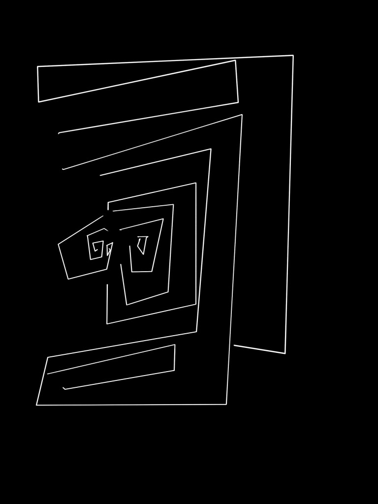
The final piece is based on the movable mechanism that connects the wires and balls in the device. At first I just wanted to draw a plan to see it, but then I realised that it was very much like a labyrinth so I made it complete. I thought the human trail was like a maze, so I drew it. I had been painting in both black and white and after comparing them I finally chose black and white for the last piece. Because I wanted to record, and the tracks are a thing of the past. So in the end I chose black and white with a mechanical feel and a composite past style.
Design sheet:


Cover sheet:
Power point:
