
2023.6.3- 2023.10.3
Essay outline:
Contrasting two modern artists who work with pearls – relatively traditional and relatively avant-garde
Pearls are a material that has long been popular with designers, particularly in the field of jewellery and related disciplines.
This article compares the differences between two designers who use pearls as a key design element. Mizuki Goltz’s style is more traditional, while Polina Osipova’s is more avant-garde.
(Introducing the two designers)
The article will mainly compare and contrast the two designers’ use of pearls in terms of material, technique and expressiveness.
Materials: Traditionally, real pearls are often used, which need to be lustrous. Or in the shape of a teardrop. The emphasis is on the beauty of the pearl itself.
Avant-garde: the pearl itself is important but the expression is greater than the pearl itself, sometimes preferring instead to work with mutilated pearls.
Auxiliary materials: mainly metallic materials, especially gold and gold metals. This traditional combination is very harmonious and emphasises the magnificent lustre even more
Not only metal, but also paper, plastic and other modern materials are spliced with the pearls.
On the one hand, there is the beautiful fact that the pearls themselves are perfect, that they are the subject of the work
On the other side, the visual impact of the large number of pearls, the particularity of the distorted pearls is better suited to expressing emotions and ideas. It is part of the work
(very different)
Technique: traditional stringing and soldering, pearl perforation. The actual style is relatively minimalist in the tradition, and therefore usually uses a circle of pearls, or half a circle of pearls strung together to make jewellery. A very fluid look
In addition to the traditional process, more often than not the tendency is to glue them together. Keeping the pearls close to each other.
(very different)
The difference
The traditional work is more focused on the pearl itself
Pioneering works show what they want to say through the pearls
Same
Both use pearls as the main material. Pearls have many symbols and have a certain value. They are very beautiful and versatile.
The comparison shows that the artists who often use pearls as their main material have quite different approaches and philosophies. Especially in terms of craftsmanship and materials. One side is mainly strung and the other more glued and the texture of the pearls is different, all of which are clearly different. But even in modern times, whether the style is more traditional or vanguard, different pearls can be used. It is clear that pearls have a powerful compatibility, and charm. Its symbolic nature, its beautiful appearance, its varied shapes and its strong presence are the reasons why different ideas have chosen it together. While Mizuki Goltz prefers to explore the beautiful lines and harmonious combinations of pearls, Polina Osipova prefers to use the storytelling of pearls to represent memories and feelings. They use pearls and therefore their work starts with some aspect of pearls. Not only are the pearls used allegorically, but the meaning of the pearls increases with their expression. This compatibility is one of the biggest reasons why the creators need pearls and are keen to use them in their creations. It would also explain why both writers can use pearls to continually create a large number of works.
The essay:
Poster:
Include text and graphics, information share is important too.(Traditional)
Purpose/ function of poster:
influence decision, perused audience
attract concentrate use text and picture, need design about colour and shape.
Image use need significant
Images should support messages visually.
composition, drama
Task:
I analyzed a historical poster, poster’s name is “Buy War Bonds” (Buy War Bonds Poster by Lawrence Beall Smith – Painting)
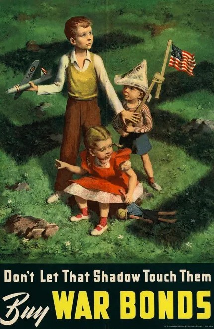
This work this is a genre that is highlighted by the theme of illustration.
The theme of this poster is to create anxiety by drawing hints that war hurts children. This is to get more people to buy war bonds for their children’s future lives and to get them to support the war financially.
The subject of the picture is three children of different ages they look restless. The powerless toy in the girl’s hand and the plane in the boy’s hand are symbolic of war and unease. Both the subject and the details give the image a sense of foreboding.
There is very little text on the posters. But it is in keeping with the straightforward and threatening style of the poster images themselves. The text in the poster is a direct statement that people should be buying war bonds as a way of keeping the shadow of war away from their children. The poster also makes the colour of the war bonds golden to give it a more focused look.
I don’t recognise the font exactly. But it is a more classic and powerful typeface. It is easily recognisable from a distance visually and is very promotional. It same with poster’s opinion and demand.
At first glance the poster uses a lot of green and red and yellow. This seems to be a good match for children and is a lively and energetic colour. In fact, the opposite is true, as the artist uses the deeper shadows brought about by the large green background. The darker the shade, the brighter the sky, the more it is darkened, and the foreboding that the beauty of childhood is about to be overshadowed by war.
It is blunt in its message that there is no future for children who do not support war, and it also includes a lot of intention in the images to lead people to think in an unsettling direction. I think it’s a very successful persuasion.
I think the threatening atmosphere and metaphors are very powerful and appealing, and when I made the poster it was probably a good attempt to make the poster powerful.
I analyzed a magazine poster, poster is designed because the Public Theater.(Paula Scher- Painting)
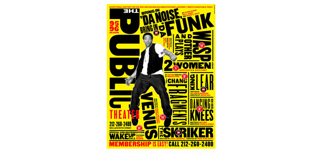
Paula Scher uses a striking black, yellow, red and white colour scheme that is very attractive. In this she mainly uses text as a genre. She linked words with visuals, something that was very original at the time. Her text is the vehicle for visual expression. It gives a very visual touch. It is in the visual and the text together that emphasises what she is trying to say. There is a sense of power that is unique to words.
Paula Scher was at her peak in the 1960s. Art and the economy were both growing at a high rate, which allowed her work to incorporate elements of compositionism, rock and roll, comics and more. Her work seems to represent the height of American art, freely taking the knowledge and elements of the era and using them. This work is mainly in sans serif type.
The period was the height of the American economy and art, and everything was flourishing. Her work is therefore diverse and powerful. At the same time the United States was promoting art that was not elaborate but simple or abstract. This is why Dadaism and Constructivism can be seen in many of her works. These were also the more mainstream forms of art in those days.
Paula Scher’s work during this period was mainly commercial and her style was therefore popular. Or rather her work has an expressive power that can be appreciated by almost everyone.
I think my final work might also need to be crammed with a lot of textual content, which would be visually more pleasing than bland content perhaps drawing on her textual presentation.
I analyzed a poster, eye-bee-M.(Paul Rand- eye-bee-M)

This is a work in which pictures are used as symbols to represent words or pronunciations. It is simple and straightforward in its reference and when one pronounces it this kind of fun makes one smile. It is very stylised and memorable.
His posters are made up of simple geometric compositions, but the things expressed are very precise. It is a work that anyone can appreciate.
There is a clear edge to his work. The different colours do not jump out of the box. In addition, the colours he uses are all of the same brightness.
In addition, the colours are all of the same brightness, so the image itself is very harmonious.
I think he has inspired me in terms of the colour scheme, rather than being stuck in a few simple colours of black, white and grey, I think it is better to be free with the colours. His work shows me that even if you use more than one colour as long as you study the colours well enough you will not get confused.
I analyzed a poster, designed by Saul Bass.

This is a poster designed by Saul Bass for Hitchcock’s film. In the film, which revolves around a man and a woman, the storyline is set against the backdrop of a complex investigation into a murder as if it were a giant mental vortex to get lost in. This poster is just that, a nerve-wracking shade of orange. The simple overlapping silhouettes of the man and woman are matched. And the spiral of alternating thin lines.
The thin lines seem to trap the male and female silhouettes in a way that fits the plot of the film perfectly. At the same time it shows this black hole of white space to the viewer. Such a composition is strongly evocative of the viewer’s curiosity. The simpler it is, the more evocative it is.
His work has inspired me a lot, and I think it’s important to avoid creating something so elaborate that you can’t find the end. The focus must be clear and unambiguous, but the details must be equally fine and intriguing.
I analyzed a poster, design by Max Miedinger.

Max Miedinger’s work is minimalist, intuitive and ahead of its time. He once designed a new metro route map, which is not very different from the version used today. But it was a huge innovation in its day and therefore a major source of controversy. He specialised in using simple, bright colours and clear structural elements to produce a clear, instantly recognisable design.
I think this is very important to learn, because expression is the most important thing. Other things like decorative details are secondary. The first thing to do is to get the point across. So I think his work has given me a great warning that I must focus mainly on making the subject matter I am expressing easily understandable. I think that’s the point of the poster. It is a visual means of communication.
Paul Rand:

Paul Rand is a renowned American designer. He specialises in designing graphic artwork, logos and more. He is known as the Picasso of graphic design. His style is a very avant-garde kind of deconstructionism.
He is famous for his reluctance to have the details of his work altered. It is also for this reason that his work is very fine. It looks simple, but in reality it is not very simple in terms of either the colours used or the structure. And it is because of Paul Rand’s unwillingness to budge on his work. This is what makes his work so simple and beautiful, yet so full of detail.
He is also very professional, for example with his NEXT, which is a poster with the letters NEXT, but NEXT is used too often in posters. So Paul Rand experiments with different fonts and sizes in order to create his own perfect NEXT.
I think it is very important to have such a serious and professional graphic designer. Because graphic design is, literally, flat. It is a very simple vehicle, so the slightest imperfection will be very obvious. That’s why I think people like Paul Rand are natural graphic designers.
Primary Research

This is a poster for Tesco. It is in a very important location, the checkout location. Anyone going to the checkout or looking towards the checkout location will see it.
It is set against a blue tinted grey and black background, which contrasts with the vibrant colours of the strawberries in the main image. Also on the background is bold white text used for eye-catching purposes. It is a very simple sentence. “Fresh berries handpicked for ripeness.” I think this phrase shows both the excellence of the goods in the supermarket with Fresh. It also shows the heart and sincerity of the supermarket to its customers from handpicked, as human resources are relatively expensive.
The main colour of this poster is red strawberries, and red is generally exciting to see. Bright red, on the other hand, gives an appetising and life-affirming feeling. It will look striking because of the base colour. Such excitement will create a certain desire to buy. If the person is not buying fruit perhaps people will go and buy it before they go to the checkout. This is what promotes consumption.
I think the poster is very simple, broken down it is just a photo and a quote. But both the text, the placement and colour and the composition are very useful. I think this poster is excellent because it has the impact that the supermarket wants.
